In kindergarten, we learned our numbers, colors, shapes, and letters through visual learning. Visual learning isn’t something that is new, but it is something that is becoming popular online and in print. Why? We are inundated with content every day, we are busy, and we need a way to digest all of the data we take in. Not to mention that some industry jargon isn’t the most accessible. As marketers, we should want our work to be understood by most anyone. Enter: infographics.
An infographic is a graphic that presents complex data in a visually appealing and easily digestible manner. Typically, infographics include text, images, icons and data. And above all, they deserve a place in your company’s marketing materials. Of course, we can’t talk the talk without walking the walk. Here are five of our best reasons to include infographics along with some of our most recent creations.
5 Reasons to Include Infographics in Marketing Materials
1. Everyone is busy.
Do people have time to read your entire annual report? Probably not. Create an infographic to showcase the same information, like we did with IMT Insurance! Visuals tell the consumer what they need to know in a clean, efficient manner before sending them on their way.
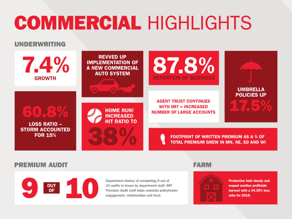
Annual reports — they’re mandatory, but they don’t have to be text-heavy. This collection of infographics comes straight from IMT’s annual report. Fun, right? This is just one component of the rebranding work executed with LF.
2. Visual learning is key.
Seeing is believing — and let’s face it, sometimes data or processes can just be too darn complex. Infographics simplify data while still conveying what’s important and engage visual learners.
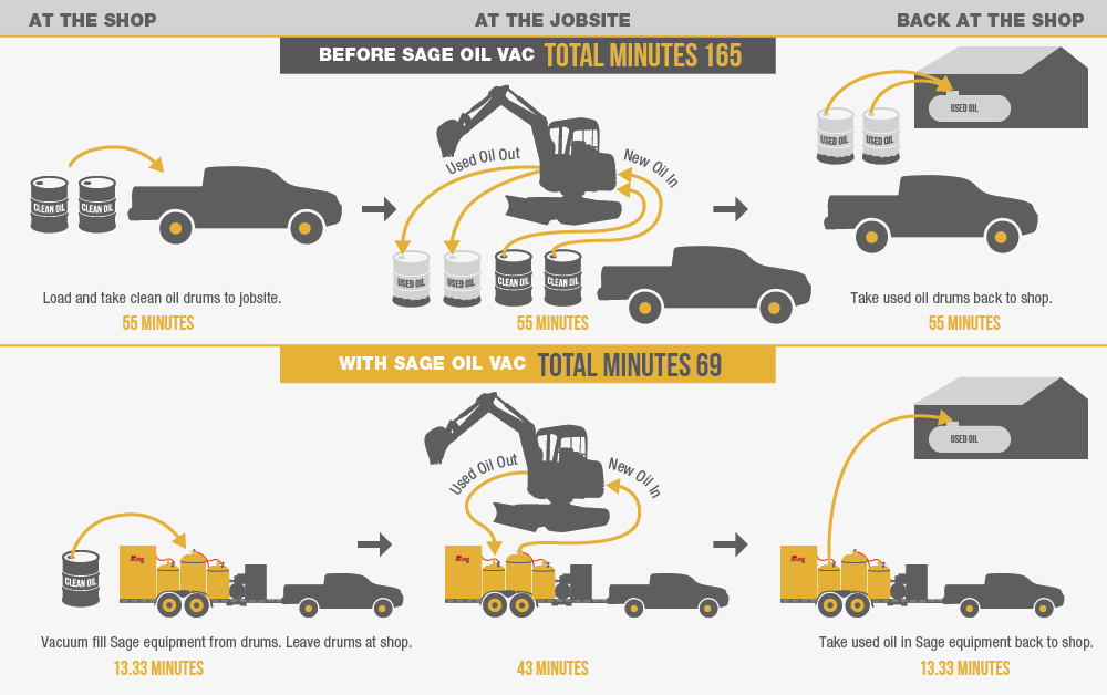
If you have ever wondered if we could condense an hour-long fuel exchange process into one image, fear not! We can and we did! Check out more Sage Oil Vac projects for inspiration.
3. Infographics can be displayed in various ways.
Infographics can be elevated in many ways — as in-article graphics on your blog or even as an animated video on a landing page or on owned social channels. The opportunity to bring inforgraphics to life is limitless and creativity is encouraged!
To showcase their Commitment to Safety, Okahoma’s Electric Cooperatives used existing infographics and repurposed into video content.
4. You can position yourself as an expert.
Infographics are a brand’s best friend when it comes to self-promotion. Once you slap your logo on that sucker and share it on social media, then voila! People will attribute their newfound knowledge to your brand and tell their friends how smart you are. Can’t beat word-of-mouth.
LF has used infographics to share the importance of SEO through video.
5. Hello, ROI! Track your data.
Once you’ve created your infographic, share a snippet of the data and link back to the original infographic on your website or blog. Use Google Analytics to track the traffic flow on these pages. Now look what you’ve done….you’ve driven traffic to your website!
6. Creatives are crazy talented.
Where would any of us be without our graphic designers? They have the ability to enhance any blog post, brochure, etc. with just a couple of infographics. We know our own creatives are something special and bring data to life like they were born to do, dang it.
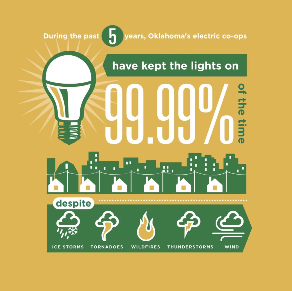
When electricity works, it lights up our life — literally. OAEC has an ultra-impressive performance rate that we couldn’t wait to show off! And yes, we’ve got a full case study about them.
Reach out and see how LF can bring your infographics to life for your brand.
This was originally written August 7, 2013, but updated for 2020 because not only are infographics still relevant — they’re also so much fun!
Mercy College of Health Sciences prepares students for a career in the healthcare industry by providing a unique education experience — unlike anything found at larger, more traditional four-year institutions — focusing on smaller class sizes, industry-experienced faculty, flexible scheduling, the latest techniques and technologies, and affiliations with hospitals and clinics. Located in downtown Des Moines, Iowa, Mercy College has built an entire legacy around its specialized healthcare education programs.
The Situation
After Mercy College launched their rebrand in 2018 (including a new logo and a new color palette) their exterior signage was updated to showcase the modernized look, but interior updates were excluded initially. The campus has several buildings including a new Academic Center of Excellence, high-tech nursing simulation lab and scores of light-drenched hallways. However, several campus spaces, including a building that was a hotel in a past life, didn’t adequately reflect the new, lively brand. For students walking around campus between classes and prospective students touring the campus facilities, there was a huge opportunity to help them continue to bolster the brand through environmental graphics.
The Solution
Lessing-Flynn worked with Mercy College to develop new on-brand experiences throughout the campus with environmental graphics. The new graphics include refreshed classrooms, hallways and lobby spaces.
Lounges
There are a handful of small gathering spaces around campus. We emphasized the College’s core values, along with medical illustrations, as a nod to the college’s history as well as reinforcing the values that all students and faculty live and breathe. The walls feature a bold flood of the brand’s purple, which helps add a richness to the space.
Classroom
One of the larger, lecture-hall style classrooms was next on our list. There was ample opportunity to make the space more inviting for students and community members alike. Oversized medical illustrations now add visual interest to the walls, helping doorways blend into the front of the classroom. The front wall was painted a neutral color to minimize distractions and allow any projected images to appear clearly.
Hall of Excellence
One of the main hallways connecting two campus buildings featured dim lighting and an old china cabinet that displayed student and staff awards and achievements. We turned this space into a branded “Hall of Excellence” to give it purpose and better highlight the Mercy College core value of excellence. New glass cabinets, along with feature lighting, help bring the space up to date. A new set of glass displays now highlight all of the Mercy College accreditations — this hall now serves as a prime stop on prospective student campus tours.
Timeline
The wall outside the President’s office had served as a storage location for the Mercy College pull-up banner backdrop. The space is at a key connection point between buildings, so we took the opportunity to showcase the history of the organization with a new timeline installation that can easily be updated into the future by swapping out the dated stand-off placards.
Entrance
The entrance to their west campus buildings originally featured a large wooden cross which, while important to the Catholic institution, wasn’t helpful in directing visitors and students to the important locations on campus. The new design offers way finding through the directional arrows, and the new Mercy College logo greets visitors and sets the stage for the rest of the branded campus environment.
The Results
The campus spaces are transformed — see for yourself in the album below! Students, faculty and staff have all enjoyed the refreshed spaces. Although it is difficult to tie the campus graphics directly to enrollment, the team has received lots of positive feedback from prospective students who have said they find the campus welcoming.
-

- Students in the newly designed classroom at Mercy College of Health Sciences
-

- The new timeline wall at Mercy College of Health Sciences showcases the school’s history.
-

- Students enjoy one of the new lounge spaces at Mercy College of Health Sciences, featuring the school’s core values.
-

- Mercy College lecture hall featuring new environmental graphics
Mercy College of Health Sciences prepares students for a career in the healthcare industry by providing a unique education experience — unlike anything found at larger, more traditional four-year institutions — focusing on smaller class sizes, industry-experienced faculty, flexible scheduling, the latest techniques and technologies, and affiliations with hospitals and clinics. Located in downtown Des Moines, Iowa, Mercy College has built an entire legacy around its specialized healthcare education programs.
THE SITUATION
The Mercy College team came to Lessing-Flynn (LF) ready to make a big impact with their marketing efforts. While their experienced faculty work tirelessly to provide the latest in healthcare curriculum — Mercy College felt their previous viewbooks were not communicating the right message or resonating with prospective students.
If you’re not familiar with college viewbooks, think of it as brochure that lays out all the reasons why someone should attend. It’s considered part of the gold-standard in college marketing — it’s used for various recruitment efforts like college fairs, high school visits, direct mail and more. So, because a college viewbook is such big piece used within the prospective student’s search process, it was important to ensure the 2018-2019 piece made the right statement.
THE SOLUTION
The traditional viewbook — you know the old 30+ page book including anything and everything about a college — well, it’s gone. That’s right, it’s completely dead. Prospective students used to get copious amounts of these hefty (and costly) print pieces, but since the dawn of the internet the needs of the prospective student audience have changed. Most potential students spend more time skimming and searching college websites for their questions rather than reading a lengthy glossy publication.
Today’s version of the viewbook has become a tool to grab attention, answer the quick questions and convey an attitude. It doesn’t give every single detail and historical reference, instead, it contains strong calls to action to the website where they can get all the extra details they want and begin the admissions process.
After reviewing past Mercy College viewbooks, LF decided to reduce and streamline the copy using a strategic content outline and design layout while incorporating a more relatable (and fun!) tone. Plus, with Mercy College’s recent brand update we made sure to use their new logo, designated colors, fonts and overall style. We also reduced the college’s “about” section and turned the focus to questions that a prospective student might have and addressed them right away. Questions such as: What majors and programs are offered at Mercy College? How do I get financial aid? What is the transfer process? How do I apply?…and many more!
THE RESULTS
The completed project provides a cohesive and concise literature piece using the updated Mercy College brand style. Both teams were able to work together to communicate the college’s story and values to any prospective student.
Recently, Mercy College of Health Sciences celebrated a record number of students who applied for admittance for the fall 2018 semester. Applications totaled 1,054 — an 8.5 percent increase over 2017. Of those applicants, 252 enrolled at Mercy College resulting in the second largest new student enrollment for any term in the college’s history.
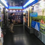
Through our partnership with the Iowa Corn Growers Association (ICGA), the Lessing-Flynn team was introduced to Golden Grain Energy. Golden Grain Energy is a privately-held company dedicated to adding value to northern Iowa’s corn production through the promotion of ethanol, a cleaner-burning fuel made from corn. As a strategic partner, Lessing-flynn worked with Golden Grain Energy and several other sponsors to create a Biofuels Mobile Education Trailer which now travels the state of Iowa educating the public about ethanol production.
The situation
Many American consumers are unaware of the many benefits of ethanol for the economy (local and national), the environment — even engines! Our challenge was to create an engaging educational display within the Biofuels Mobile Education Trailer to explain the benefits of ethanol production and encourage its use as a preferred fuel option and create support for it’s production within our state.
With a lot of information and limited display space, our team wanted to be creative and strategic in content creation to make sure the experience was informative, digestible, high-tech and relevant.
The solution
When planning the Biofuels Mobile Education trailer’s content, we worked with the team of sponsors to establish our audience as potential ethanol consumers, with nods to farmers and agriculturalists who would also be interested in viewing the display. From there we chose our theme “Engine Smart, Earth Kind” and categorized our content planning to highlight four key buckets (or as we call it — the four E’s of ethanol):
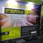
The environment
Many consumers walking through the trailer care about the environment and how ethanol plays a role in taking care of our world. Adding ethanol to gasoline reduces tailpipe emissions of harmful pollutants, such as carbon monoxide, exhaust hydrocarbons, air toxins and fine particulate matter. Plus, ethanol production requires less water than gasoline production.
This content portion was highlighted with a cylindrical tube, hot wheel car display and large infographics with supporting facts. An endorsement for ethanol from the American lung association was also featured.
The economy
Ethanol production brings huge benefits to the American economy with all the jobs it supports and creates. To highlight this, we created a dimensional cylindrical tube display that broke down the many uses of corn with an accompanying flow chart on the ethanol production timetable and the many careers involved at every stage.
Homegrown energy
Our nation’s energy independence and it’s role in our economy is another crucial benefit to consumers. Using homegrown, renewable energy, the U.S. can replace 540 million barrels of crude oil imported from overseas. We used infographic designs to highlight this and several other supporting facts.
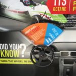
Engine smart
Engine performance was the last section the audience would engage with. This section was strategically placed at the end of the trailer layout because this was the a key takeaway that we wanted visitors to remember when they exited the trailer.
The content in this section helped educate consumers on which fuel would work for their vehicle, so they were aware of their ethanol options at the pump. This section included an interactive touchscreen and steering wheel to displays facts, and an ethanol pump with an interactive iPad inside the pump displaying the five different blends — E-15, E-30, E-85, Regular Unleaded 87 and Super Unleaded 87.
Bonus Content: View the E-15 “Super Duper” campaign that Lessing-Flynn completed with Iowa Corn.
The results
Since the launch of the Biofuels Mobile Education Trailer on June 27, 2018, it has traveled to more than 50 events and has had more than 15,000 visitors. To track our results we installed a people counter to the trailer entrance. The District Field Managers of Iowa Corn have had nothing but positive feedback from consumers walking through the doors. It has been a positive tool for them to take to events for education, outreach and promotion.


Your brand is the face of your business, and you want to put that face in skilled hands. You wouldn’t trust a face lift from some Joe Schmo plastic surgeon with Craigslist credentials, so why would you let someone design things for your company with little-to-no experience? Lessing-Flynn Creative Director Chris Hanson is here to explain what it takes to be a graphic designer, and why it’s important to find someone skilled to do your design work.
Finding photos that match your brand aesthetic is hard. A lot of time can be spent searching for the perfect stock photo only to end up with something generic that your competitor could already be using. Why not get noticed by procuring custom styled photos for your brand? Not all royalty-free and general stock images are bad, but being unique is the name of the game. Still on the fence? We’ve got a few arguments to tip the scale:
You’re investing in your brand. Styled photographs may seem like a frivolous expense to some, but it’s a valuable investment to communicate brand quality. It’s hard for an audience or customer to take a brand seriously if the photos look like garbage. If you look the part, you’re more apt to get noticed.
 Consistent, quality photos create trust. A consistent look builds trust with your customer — you should strive for instant brand recognition. Well designed marketing photos with the right styling will help tell the story of your brand. The audience will assume the product or company will have the same values the photos
  communicate.
With social media, you might only get one shot. Mobile engagement and social media have become the new norms for brand interaction, so standout marketing photos are now more important than ever. You need to be able to stop someone mid-scroll for a quick double-tap, like or comment. Your audience is much more likely to be engaged with good marketing photos than with text alone – especially if the images are targeted to a specific audience.
Need help creating the perfect styled shoot for your brand? We’ve got you. Contact Lessing-Flynn for more information.
I first realized motion graphics were becoming an important facet in graphic design during my senior year of high school. While applying to colleges, I came across a school that sent me a promo disc of their classes — “Motion Design” came on the screen and it clicked for me, right there. This whole video was designed from start to finish. Motion design is the future. I knew I wanted to explore animation from then on and the rest, as they say, is history.
Here are four reasons to consider using animation in your company’s marketing needs this year:
Engaging. Stop people mid-scroll on their Facebook feed, webpage and more. Animations keep information moving in a format that speaks to a larger demographic using color, movement and music.
Digestible. With motion graphics, complex ideas can come to life. If you have a lot to say, and you’re worried that a printed format might leave your readers confused, an animation style video might the solution. Add visuals, on-screen text, maybe a bit of badass music or a voiceover. Boom. Done.
Flexible. The versatility of animation is unmatched. It’s great for website, mobile or tablets and designs are not limited to just videos — heck, you can make custom gifs! No, all gifs are not designed with space cats riding pizzas and shooting lasers out of their eyes, gifs can be productive too. They can be used to create wildly engaging social posts. Wait — there’s more. All those nifty illustrations you see flying around in your video can be repurposed into any number of print pieces as well.
Economical. Depending on the type of video you want to produce, animation can be incredibly cost effective. Consider the budget needed for one or two camera men, a producer/creative director, plus talent to spend a day shooting enough footage for a :30-:90 second video. Then think through the time your video team will need to spend reviewing the footage afterwards, adjusting audio and piecing it together into the final video. Plus, last-minute edits to the script and potential reshoots. Now think about that budget compared to a small team of designers, animators and copywriters needed to create an animated project where they can nimbly adjust and edit throughout the process. Animated video is very economical in comparison.
The Bottom Line. Animation holds a hotbed of potential for your brand. The possibilities are endless because you’re not limited to what’s just in front of you — you’re tapping into true creativity! Want to hear more? Contact Lessing-Flynn about creating your motion graphic project today.
What We Can Do — Client Examples:
As someone who designs and develops websites, I’m often asked: What goes into building a great site? For those who don’t create website code, it can seem mysterious and unapproachable and at times the investment of time and money can seem daunting. To better explain what it takes to create a functional and well-designed website I like to use the analogy of building a home from the ground up. It’s a concept most people have experience with and it parallels building a website pretty well — so let’s break each web component down and build this house together.
Putting Together the Blueprint: Design and User Experience
Before we begin to code, we need a design from which to work. Like a blueprint for a new home, web designers usually begin by plotting out pages on paper or using design software like Photoshop. This gives the website developer something to work from that includes specific measurements.
Many times agencies will take some time at this point to do a bit of user experience research. User experience (UX) design helps to ensure websites work in a way that users enjoy and that meets your goals. Just like you wouldn’t design a house with stairs to nowhere, UX makes sure a website functions in an expected and meaningful way.
Starting Construction: Building with HTML and PHP
Now that the plans are in place, it’s time to start building. When it comes to web developers, that usually means HTML and PHP. These two coding languages provide the basic structure for the website.
HTML, or HyperText Markup Language, serves as a building block for any web page. It determines where content goes and how various elements fit together. Think of it as creating the rooms and boundaries. HTML helps to construct areas for things like the navigation, sidebar or footer.
PHP (which originally stood for Personal Home Page) compliments HTML and works alongside it to make things easier. Using our analogy, PHP acts like prefabricated construction materials. When crews are building a house, they don’t usually construct a door or cabinets from scratch. Instead, they use doors and cabinets that are pre-built to help speed up the process. PHP works similarly by allowing developers to reference pieces of code many times throughout the site.
Interior Design Time: Styling with CSS
The walls are up, so it’s time to get creative and add some style — that’s where CSS comes in. CSS, or Cascading Style Sheets, help a design come to life. Without it, your website wouldn’t be much more than a blank white page with text and links. Just as an interior designer makes a house more attractive by adding paint, light fixtures and flooring. CSS makes a website more attractive by adding colors, images, fonts and other styles.
Hooking Up the Utilities: Adding JavaScript for Functionality
If HTML was the structure and CSS was the style, JavaScript is the utilities. It would be pretty inconvenient to live in a house without electric lighting or running water. You could survive, but not without having to make some major adjustments. Like electricity, JavaScript adds functionality to your site to make it more interactive.
If you’ve ever visited a website using animations, photo galleries, pop-ups or other interactive elements, chances are it was using JavaScript. You might take these little touches for granted, but they do a lot for creating a cohesive user experience. You might take turning on a light switch for granted, but think of life without these luxuries!
To Be Continued… Moving In
We hope this house analogy helps you understand the basic building blocks of a website, but Lessing-Flynn’s team of experts are also always here to help with questions on any of the concepts listed in this article. Check back for part two to better understand what happens after your website is built!
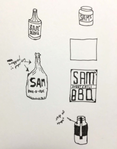
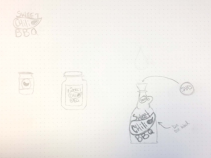
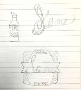
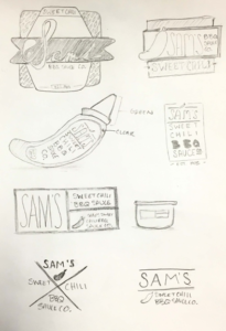
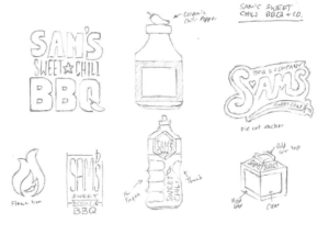
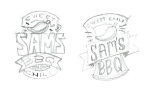
Artists love to doodle, so a majority of graphic designers start a project by sketching a thumbnail design. For the non-art folks, a thumbnail can be generally defined as a small hand-drawn sketch. They’re handy because they allow you to fit several drawings on one piece of paper. As visual people, we use these sketches as a way to brainstorm and get as many ideas — good or bad — out of our head and on to something tangible.
I’m not here to tell you how important it is for designers to sketch before starting projects. You can find those articles all over the internet. My intent is to illustrate how each designer is different in how they think and how they use thumbnails in their creative process. What one artist uses to remind themselves of an idea most likely means nothing to their colleagues.
I gave our creative team a little exercise to prove my point. They were given a creative brief to design new packaging for a fake barbecue sauce product and told to create thumbnails to showcase their concepts. Here’s the creative brief:
“Sam’s Sweet Chili BBQ Sauce Company needs a label design for their bottled sauce to be sold in supermarkets. Think about how the packaging can stand out against its competitors on a shelf. Like the name says, the flavor is sweet chili, so it has a kick. Use that as inspiration for your design. Consider all aspects of the packaging in your design/sketch, including the label and the container itself.”
Let’s see what we can find out about our designers through their sketches, shall we? Just like handwriting, it’s amazing how unique thumbnail sketches are to each designer.
A quality photo is just as important (if not more) as a quick and witty headline in today’s media. The more engaging your image is, the more click-throughs, likes, loves and wows (*eye roll* thanks a lot Facebook… all we wanted was a “dislike” button) your post will receive. I mean, that’s the end game right? More viewership and loyalty. So, picking the right image is paramount.
As a designer, I’ve become very familiar with the phrase: A picture is worth a 1,000 words. And that might very well be true, but when your options are limited for a project and you have to resort to stock images to fill the gap – well sometimes those 1,000 words can turn to mockery. If you’ve scanned through any stock image gallery lately you know exactly what I mean, but allow me to show you a few gems just for fun.

Search term: “Exercise”
I don’t know about you, but I love to get up every morning, walk into my big white room and stretch using a folding chair. Yes.

Search term: “Collaboration”
The woman in the black is all like: “Kathy, I’m sick of looking at your cat photos. This isn’t even your cat.”

Search term: “Productivity”
Let me just be productive by avoiding this meeting to be on my phone inside this all glass room.
Search term: “Communication”
Let’s pretend for a minute that this illustration isn’t the definition of Clipart and just look at the concept: someone is thinking about communicating about communication? This is like… communication INCEPTION! My brain hurts – what year is it?!

Search term: “Teamwork”
This might say teamwork to some, but to me it says, “HR situation in the making.”
Now I’m not trying to bag on Thinkstock – they’re just trying to provide people like me with images that at least “sort of” work for your needs. Just remember sometimes you have to dig a little to find the actual gems in the ocean of free images. Here’s a few attributions I look for when choosing stock photography.
- Vibrant colors
- Clear subject
- Image appears to have depth
Staying on-trend is always important as well. Here are a few trends to keep in mind for 2016:
- Images covered in a gradient. Images with washed-out exposure (Ex. Newspaper-y tone).
- Top down shots (Ex. Looking down at a desk where everything is nicely laid out – people with OCD LOVE these photos.).
- Big, open shots with a small subject. These are meant to make you feel serene. Super close-up images (Ex. Someone’s eyes and the bridge of their nose.).
- You can’t always find these things in a photo, but use your best judgment and take into consideration the work the photo will be representing.