Brand colors are an immediate way to evoke an emotional response to a brand. As an art director at Lessing-Flynn, it’s my job to gauge that potential response through design, but there’s more too it than you might think.
A brand is not just a logo, identity or tagline, it’s the feeling that is created by the sum of the brand’s parts. The brand colors used in a logo may be one of the most important considerations. The use of color in brand development or rebranding can be used to create a hierarchy of dominance and balance in the whole design.
When I am working on a client’s brand identity, all aspects of branding and the client’s position are taken into consideration when determining the color palette I am going to use. I then try to focus on three main points:
- Whether the company is a business-to-business or business-to-consumer company
- If the company is product driven or service driven
- Which brand colors will have an emotional and psychological impact on the client’s target audience
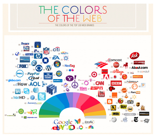
I recently read this article on the color palettes of popular logos on Social Media Today that showed many U.S. brands stick to just a few colors. You can easily see from the infographic that red and blue are the two most widely used brand colors.
 Red is a warm color that conveys positive energy and strength. Blue is a cool color that is comforting and can convey trust and loyalty. It is very important to understand the psychology and emotion each color has on a person while working on the design. A brand discovery process of some sort is needed to really delve into the emotions and feelings the brand is trying to convey to its target audience. For example, if your product is organic, the color green might be a good choice to reflect the brand’s “value” to the consumer, since green represents the earth, health and nature. Here’s a great resource for the psychology of colors.
Think about your favorite brands – according to this “color branding” idea, does the brand’s color scheme match what feelings it is conveying? And if you’re developing your own, make sure to take into consideration which brand colors will be most effective for your product or company.
Are you curious if your brand’s logo portrays the best possible emotional and psychological impact on your target audience? The Lessing-Flynn team can help! Contact our art team today for a brand analysis and refresh.
Chris Hanson has been an art director at Lessing-Flynn for 14 years.
Originally published June 26, 2013
LF Newsletter Alert
Want Lessing-Flynn to rock the socks off your inbox with insights and more?