When I am working on a client’s brand identity, all aspects of branding and the client’s positioning are taken into consideration when determining the color palette I am going to use. I then try to focus on a few main points:
-
- Whether the company is a business-to-business or business-to-consumer company
- If the company is product driven or service driven
- Which brand colors will have an emotional and psychological impact on the client’s target audience
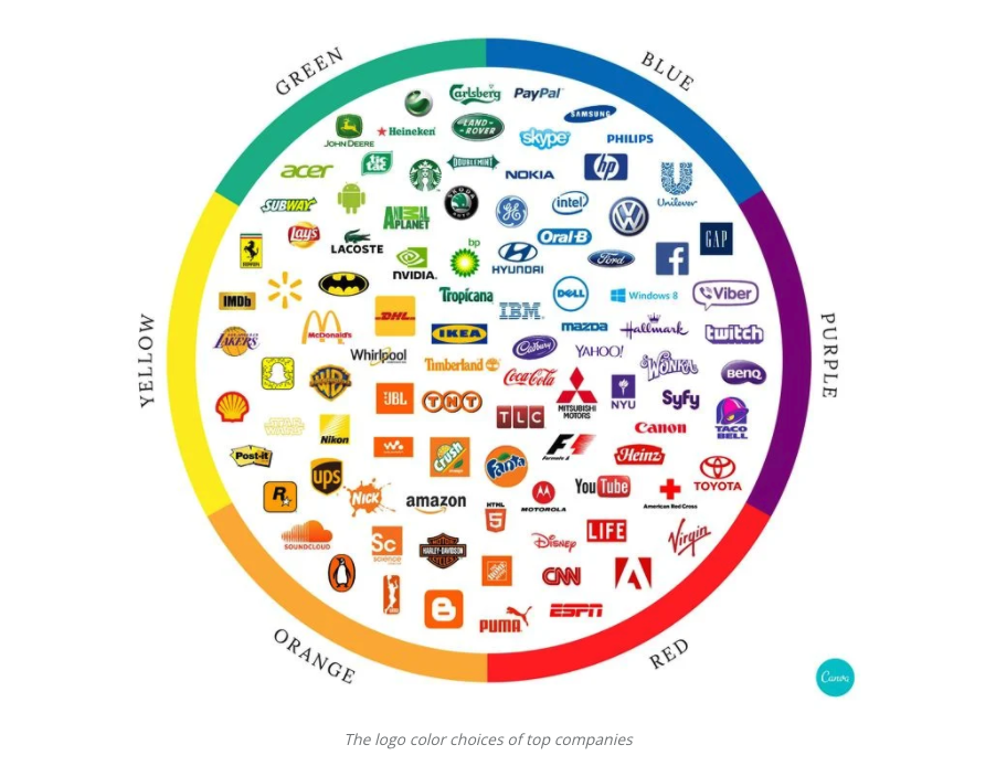
This Canva article explains how color is a powerful recall tool and how big-name brands use color. It is no wonder that a majority of financial brands choose blue as their brand color, blue is a cool color that conveys trust, loyalty and stability. It is very important to understand the psychology and emotion each color has on a person while working on the design. A brand discovery process of some sort is needed to really delve into the emotions and feelings the brand is trying to convey to its target audience. For example, if your product is organic, the color green might be a good choice to reflect the brand’s “value” to the consumer, since green represents the earth, health and nature. Check out this great resource for the psychology of colors.
Think about your favorite brands – according to this “color branding” idea, does the brand’s color scheme match what feelings it is conveying? And if you’re developing your own, make sure to take into consideration which brand colors will be most effective for your product or company.
Are you curious if your brand’s logo portrays the best possible emotional and psychological impact on your target audience? The Lessing-Flynn team can help! Contact our art team today for a brand analysis and refresh.
Chris Hanson has been an art director at Lessing-Flynn for 14 years.

Originally published June 26, 2013
Ever get the itch to purge your life of clutter? You know — all that unnecessary stuff that just isn’t “you” anymore. Sometimes it’s just straight-up junk taking up space. The same thing can happen to your brand over time. Occasionally you just need to take inventory of your content and reassess. Lessing-Flynn’s brand refresh checklist can help.
We want to make sure you look and sound good, so let’s get started. Does your company fit into any of these categories?
- Your look is outdated. No one wants to be the loser still wearing a cummerbund or shoulder pads at the party. A company logo, website and subsequent social channels can (and often do) go out of style or become stale. Color choices and trends in particular tend to change frequently. In many cases, a fresh look for your brand could bring renewed vibrancy and excitement to your company. Logo updates usually have reinvigorating effects on employees as well as customers and could add a jolt of long-overdue vitality to your organization.
- Your vision has changed. If your organization’s goals, services, target market, partners or mission statement have changed, you may want to reflect that in your branding. At its core, the company branding should illustrate who you are as an organization. It’s your first introduction and the lasting impression of your company that consumers and key industry leaders remember.
- Your company has grown. Has your company acquired new sub-brands or additional businesses under its umbrella? Brands get complicated when there are multiple logos representing different products, services or segments of their business. You don’t want to have five bumper stickers on the back of the minivan. Brand alignment can help set new standards for logo use, clear up brand confusion and provide an opportunity to refresh campaigns.
Simple brand refresh checklist
If your company falls into one of the buckets above, obviously our first suggestion is to contact yours truly here at Lessing-Flynn for a creative overhaul, but if you’re a do-it-yourselfer (or maybe you’re in denial about the severity of the problem), we suggest that you at minimum review your website content and social media accounts to make sure your brand voice is the same throughout and everything still works/is accurate. Here’s a quick brand refresh checklist:
- Click through links throughout your site to make sure they work.
- Read every live blog to make sure it is still relevant and search engine optimized.
- Check that your products, services and contact info are up to date.
- Review your core value content to make sure it aligns with current company goals.
- Update employee biography pages.
- Make sure website copyrights and trademarks are listed correctly.
- Watch all YouTube/Vimeo videos to make sure they are still relevant and reflective of your brand.
- Update social media accounts to make sure images, graphics, headers, contact and about info are all correct.
- Double check that your company biography matches your current brand voice.
- Inactivate any social accounts that have not been kept up.
Don’t be a hoarder
Sometimes removing outdated content that can’t be refreshed or scrapping an old logo feels like you’re wasting resources or removing/deleting brand history. FIGHT THAT FEELING. Keeping things because is feels like you might use or need them later, or because you’re emotionally attached, is called hoarding. Keep your eye on the future, not the past. Your audience deserves the best, most current version of your brand. You can do it!
Originally published April 1, 2016
At Lessing-Flynn, we consider ourselves to be the stewards of brand storytelling. Sure, other labels apply: account managers, copywriters, art directors, PR specialists, web designers, social media maestros, voracious consumers of sandwiches, etc. But first and foremost, we focus on brand storytelling.
We serve businesses from a bevy of industries and partner with organizations advocating exceptional causes. No two brands provide the same products and services or champion identical issues. Similarly, the opportunities and resources available to our clients differ greatly.
There is, however, one commonality among all of our brands: They all have interesting stories to tell. And it’s our job to tell these tales in a way that resonates with customers and stakeholders alike.
What’s the secret to good brand storytelling? You’ll soon find out.
The Six Cs of Brand Storytelling
Captains
Having a powerful central figure gives your story a protagonist. Someone to root for. These are the entrepreneurs, the visionaries and the innovators. The story of Apple will be forever linked to Steve Jobs. So, too, is the story of Walt Disney Studios permanently tied to Walt Disney. Facebook and Mark Zuckerberg. Microsoft and Bill Gates. The list goes on and on.
At Lessing-Flynn, we channel the energy of our namesakes: Paul Lessing and Roy Flynn. Does your organization have a protagonist that has the power to rally clients and onlookers alike? They’re the secret to playing the long game. Not to brag, but we’ve been around since 1907.
Culture
Raise your hand if you know who Larry Page and Sergey Brin are. Not ringing a bell? Google co-founders Larry Page and Sergey Brin are great visionaries and entrepreneurs, but neither is a very compelling central figure. That’s why few people consider Page and Brin to be the essence of Google.
When your company has no face, lean on culture. By investing in state-of-the-art facilities, product development and employee happiness, Google has fostered an almost mythical culture. It’s a fun, exciting and wondrous place where extraordinary things happen. A modern-day Wonka Chocolate Factory. Obviously, no company is Google. But companies that heavily invest in upgrading facilities, developing great products and keeping employees happy typically have good cultures.
Customer Service
What company doesn’t champion its unyielding commitment, dedication and devotion, and absolute customer satisfaction?
Buzzwords, much? Indeed, that kind of corporate rubbish appears on just about every About Us page on the web. Truth be told, few brands walk the walk. Those are the companies that get talked about. Go above and beyond for your brands, and they will rush to social media in order to sing your brand name’s praises. In other words, it’s your customer base and brands who must tell the story of your great customer service for you. So give them a reason to.
Capacity
Size, scope and structure matter. Having the largest parts inventory, the most extensive dealer network, the most product specialists, the largest facilities … the biggest, dopest Chinese finger trap.
Your company invested heavily in putting the right talent, resources, infrastructure and Chinese finger traps in place. If it’s worth investing in, it’s worth talking about. Talk about what makes your company the company.
Customers
Your company can throw cash money at a celebrity spokesperson, but such endorsements are often undermined by the fact everyone knows they’ve been bought and paid for.
Consumers are smart enough to know Kylie Jenner probably doesn’t eat Burger King on a regular basis. But when Microsoft Surface Pro started using their commercials to showcase how real illustrators and artists use their product, credibility grew. Microsoft reported a 21% year-on-year rise in Surface sales last year. Few things are more powerful than the testimonials of real people. How have your products and services helped your customers and who among them are willing to tell their story?
Consume a Sandwich
After you’re done crafting the perfect story for your brand, take some time to relax, reflect and consume a sandwich. Just because Kylie Jenner doesn’t eat Whoppers and Impossible Burgers doesn’t mean you can’t.
Storytelling is a learned art, but all it takes is some practice. Think about what aspects of your brand are most factually important but also have the largest emotional appeal. Using your sharpened brand storytelling skills, go out and make people care.
This was originally written June 4, 2013, but brand storytelling is timeless! Tell it with authority this year.
When the concept of email newsletters first began, it was a mere vessel to send out humble brags, generic information and boring company updates. If that content strategy sounds like your company’s newsletter: 1) well, this is a tad awkward, 2) please stop doing that.
While this old newsletter content strategy is useless, successful marketers know that quality email marketing is still one of the best tools available, especially for service-based businesses. This reinforces the fact that, hands down, there’s nothing more valuable than direct access to someone’s attention. So let’s talk about how to create and send an effective email newsletter to your audience.
Newsletters Done Right – The Setup
Establish your content calendar (and be consistent).
Your newsletter should work towards these three things goals: staying on-brand in voice and style; providing rich, relative content; and being niche enough to stand out. Around 82% of B2B and B2C companies already use email marketing, so it’s important you stand out from the crowd.
And like we mentioned previously, don’t be too self-serving. A good rule of thumb is to only use 10% of the newsletter’s content to promote yourself.
Give it a cool name.
This is arguably the most fun part. Remember, subscribers should get excited to see your newsletter in their inbox. Catch their attention and capture their hearts with a name that sums up who you are in a professional-yet-personal way. Are you a reusable water bottle company that wants to start a newsletter that promotes sustainability? Congratulations: Your newsletter is called “From the Tap.” You can use that if you want, but not for free. My check better be in the mail.
Choose your layout wisely.
Layout is important. Newsletters may be a marketing industry standard, but each is different depending on what kind of content you’re wanting to include. If you’re a startup photography business that solely wants to promote your work, it would make sense for your layout to have more imagery and less copy. But if you’re looking to share industry trends with your reader — like top 5 equipment trends this season — then the copy deserves a bit more room. That being said, a newsletter isn’t a blog. If anything, it’s just teasing the blog you already have, so be be stingy. Links to long-form is better than actual long-form.
Craft the perfect subject line.
Hate to break it to you, but “Here’s my newsletter!” isn’t going to prompt anyone but your grandma — who loves you very much — to open your email. I know; it’s heartbreaking. Luckily, subject lines aren’t too big of a beast to tackle as long as you remember one little acronym: CTA.
Call-to-actions (CTAs) are proven to increase a newsletter’s number of opens. They’re typically written as a command or action phrase because you want the reader to act in a certain way. Using the word ‘you’ in your CTA will also increase number of opens because the reader will feel like it’s personal and necessary to read. Example: “The ag industry needs you to speak up” — the CTA is clear, addresses the reader directly and references a piece of content featured in the actual email. I would know — I wrote it. It doesn’t hurt to incorporate questions, numbers and the occasional emoji either.
Send a test email.
Some email marketing services allow you to send out a preview of your newsletter to a group of your choice before the actual scheduled send. This is an essential step, so don’t skip it! You’ll be able to see how everything looks from a subscriber’s point of view without having to solicit outside insight. This also gives your leadership team a chance to sign off or suggest final edits.
BONUS: Testing emails gives you the opportunity to see how your newsletter appears on a mobile device, which is of MEGA importance. Why? The most common device that people open emails on is an iPhone, according to Experian Marketing Services. And people who open an email on both their mobile device and computer are 65% more likely to click through to the actual content. That means the extra time it takes to optimize your newsletter for mobile is going to be well worth it. Yay, accessibility!
Schedule successfully.
This step may take a couple tries to get right, and that’s okay. Different people open their newsletters at different times of the day, and that is most likely the case with your batch of subscribers. Look to see if your email marketing tool of choice offers schedule optimizing. You don’t have to use it, but it’s a nice tool to have, especially if your number of opens has been dismal lately.
>>Check out part 2 to make the most of your newsletter metrics.
The Coalition to Support Iowa’s Farmers is a non-profit, non-partisan organization that provides assistance to Iowa farmers at no cost. That means that dollars from their various funding organizations go directly to programs to assist farmers, and not to marketing efforts. This left their website an underutilized resource that wasn’t doing all it could to help them serve the needs of Iowa’s farmers.
THE SITUATION
As the Coalition approached its 15th anniversary, it was time to give their original website a face lift and ensure that it met the changing needs of Iowa’s farmers. Since the site originally launched in 2004, more and more farmers began trying to access the site on their mobile devices. However, the experience was poor and data told us that most mobile visitors quickly exited the site, likely without finding the information they needed.
Previous website:
THE SOLUTION
Lessing-Flynn worked with the Coalition to design a new, mobile-optimized website. Being a livestock farmer can be a difficult and busy business, so making sure the important information was easily accessible was vital. The site features a simplified, user-friendly navigation, additional resources clickable right from the homepage and in-page linking to make sure visitors find what they need wherever they look.
The Coalition begins most relationships with farmers via a phone call, so featuring their assistance phone number prominently was important. The number was previously buried on the contact page on their old site, so we brought it to the forefront in the website header and made sure that it was a click-to-call link so visitors could take action directly from their mobile device.
Since Coalition services are constantly changing, the site needed to be developed in a way that would allow the team to build new pages. Although we designed a handful of custom templates for the more unique pages, the rest were built with a flexible content system which allow the team to drag and drop content sections as needed to build a page, whether it includes an FAQ, resource library, video or more.
THE RESULTS
The site officially launched in November 2018. In the three months post-launch, website traffic increased 263 percent and pages per session nearly doubled.
“The Coalition to Support Iowa’s Farmers was founded with the mission of working with Iowa farm families to provide guidance and help implement on-farm best-management practices for raising livestock responsibly and successfully,” said Coalition Executive Director Brian Waddingham. “This new and improved website is our latest step in fulfilling that mission.”
According to Waddingham, calls for support have increased since the launch. He also says numerous farmers have referenced visiting the site prior to calling in for answers to their questions.
“I refer a lot of farmers to our website for information and have heard many positive comments about how professional the site looks now,” Waddingham said.
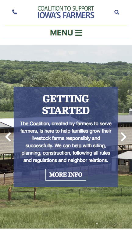
Current mobile view:
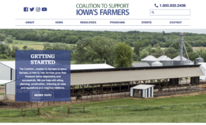
Current desktop view:
Over 389 films share a sound design cinematic universe, from Star Wars to Toy Story to Anchorman; They all feature the “Wilhelm Scream” in one way or another. The Wilhelm Scream (You’ve heard it before, somewhere, guaranteed) was created for the 1951 western Distant Drums. The sound effect became a part of Warner Brothers sound library and eventually became an inside joke among sound designers.
The scream made its first big break when George Lucas asked Ben Burtt to sound design his upcoming film, Star Wars. The scream lived on in every Star Wars and Indiana Jones film and exploded from there, to over 389 films and countless more TV show. Today it’s remixed and re-used in so many different ways well beyond the “Alligator biting man” of the original recording.
THE ARGUMENT FOR BRANDED AUDIO
While the Wilhelm scream is a fun inside joke, there’s something to be said for unique audio identity. The proliferation of affordable and high-quality stock music had led to a lot of brands unknowingly sharing the same music. I’ve worked with audio tracks weeks on end during the editing process, so they’re often burned into my brain. They’re inescapable in today’s media, I’ll hear stock music walking into Costco, in TV ads and at trade shows. I’ve heard one stock song over 20 times across multiple brands and genres.
Your audio brand is more important than ever, and music serves as a very powerful tool to quickly reinforce your brand in a sea of short attention spans and shorter run-times. Music works to set the tone for a spot and can be a short-hand to convey tone and location that’s not easy to do in a visual medium. Check out this video with the same footage and four distinct pieces of stock music. Everything else is constant but the emotion of each track is so varied.
CUSTOM VS. STOCK SOUNDS
The right stock music sets up the tone and emotional context in the right way. These emotional cues are extremely effective and can set a scene faster and more efficiently than visuals alone. Putting the audience in the right context is incredibly important for conveying the message of the spot in a limited time and with impact.
So high quality stock music is both incredibly important, yet many brands unknowingly share the same audio assets, lessening your brand’s unique identity. There are two different approached to this problem. First video content creators need to be mindful of finding new interesting music that’s not overplayed and overused. I maintain a list of ten stock music sites that offer deeper cuts that’s less well known and over-used. By being diligent in the production process we can ensure that each brand gets the song that fits them best without going to the “greatest hits” bin of stock music.
Custom music is a definite solution but can be pricey. But along with it comes incredibly control over the product, allowing content creators to create the exact sound they’re looking for to tell the story. While bespoke music isn’t cheap it’s become more affordable thanks to developments in the gig economy. New sites like MusikPitch allow you to describe your project, needs, budget and timeline and allow various creators to respond and bid for the work. This lowers the cost of custom music and allows content creators to work directly with composers and musicians. Moreover these artists aren’t limited regionally or nationally but often times are located all over the world, bringing in fresh sound and perspectives.
But custom music does have downsides; chiefly among them is time. Custom music isn’t fast — from finding, selecting and sharing the vision with musicians, their time to compose, revise and deliver can take several weeks, whereas stock or licensed music is just a click and credit card away. There’s no right or wrong approach, just whatever fits the vision, budget and timeline of the project.
DEFINE YOUR VOICE
Defining the voice of a brand using stock music is equally important; vastly different tracks from one spot to the next lowers the cohesion of the brand and created a scattered feeling. The voice of the brand must be considered during the post production process and must be something the creative team agrees on.
Affordable stock and custom music is more available than ever. But video creators must be conscientious to find the music that best fits the brand in both the right voice and uniqueness — avoiding the most popular bin is a must at all costs. It requires spending more time and playing with the right sound mix but the end product is much higher quality, it’s worth the effort.
I first realized motion graphics were becoming an important facet in graphic design during my senior year of high school. While applying to colleges, I came across a school that sent me a promo disc of their classes — “Motion Design” came on the screen and it clicked for me, right there. This whole video was designed from start to finish. Motion design is the future. I knew I wanted to explore animation from then on and the rest, as they say, is history.
Here are four reasons to consider using animation in your company’s marketing needs this year:
Engaging. Stop people mid-scroll on their Facebook feed, webpage and more. Animations keep information moving in a format that speaks to a larger demographic using color, movement and music.
Digestible. With motion graphics, complex ideas can come to life. If you have a lot to say, and you’re worried that a printed format might leave your readers confused, an animation style video might the solution. Add visuals, on-screen text, maybe a bit of badass music or a voiceover. Boom. Done.
Flexible. The versatility of animation is unmatched. It’s great for website, mobile or tablets and designs are not limited to just videos — heck, you can make custom gifs! No, all gifs are not designed with space cats riding pizzas and shooting lasers out of their eyes, gifs can be productive too. They can be used to create wildly engaging social posts. Wait — there’s more. All those nifty illustrations you see flying around in your video can be repurposed into any number of print pieces as well.
Economical. Depending on the type of video you want to produce, animation can be incredibly cost effective. Consider the budget needed for one or two camera men, a producer/creative director, plus talent to spend a day shooting enough footage for a :30-:90 second video. Then think through the time your video team will need to spend reviewing the footage afterwards, adjusting audio and piecing it together into the final video. Plus, last-minute edits to the script and potential reshoots. Now think about that budget compared to a small team of designers, animators and copywriters needed to create an animated project where they can nimbly adjust and edit throughout the process. Animated video is very economical in comparison.
The Bottom Line. Animation holds a hotbed of potential for your brand. The possibilities are endless because you’re not limited to what’s just in front of you — you’re tapping into true creativity! Want to hear more? Contact Lessing-Flynn about creating your motion graphic project today.
What We Can Do — Client Examples:
Welcome back for the second part of Home is Where the Code Is! In this two-part blog series, we’re answering the question: What goes into building a great site? We’re using the analogy of building a home from the ground up to help explain what it takes to create a functional and well-designed website, and today we’re ready for move in day. Now that the new website is built and you’re ready to unpack those boxes — this is where the content comes in.
Move in Day: Adding Content
Content like copy, graphics, images, videos, downloads, etc. is what fills your website and makes it yours. Without it, there’s no reason for your website to exist. It’s sort of like throwing a party at your place without dishes or chairs. You may choose to transfer over content from an old website or print materials or you could create completely new content. Often, it’s a combination — updating and transferring existing content while also adding new. Whatever the case, content gives your site purpose and a reason to visit.
Home Maintenance: Upkeep, Repairs and Marketing
Finally, there’s the upkeep. Things are great now, but inevitably you’ll have to do some upkeep and repairs down the road. After all, you don’t want your website to fall into disrepair and become an eyesore — you need to keep things pristine to continue to attract new visitors.
That’s where tools like analytics tracking, search engine optimization, pay per click advertising and content marketing come into play. You want to keep people stopping by and clicking — how else will you meet those digital goals? All the above are great ways to do just that.
Analytics tools, like Google Analytics, will help you track how many people are coming to your site and what they’re doing. It’s sort of like a home security or monitoring system. Data paired with professional analysis ensures your site is threat-free and performing well.
Search engine optimization works like a phonebook listing. If someone wants to find you to stop by, they’re going to need your address. SEO assures people can find your website by helping it to rank well in search engines results and local directories like Yelp.
Pay per click advertising is another way to put your home address out there so to speak. SEO will help get out the message, but a quicker, more targeted approach is advertising. Like buying an ad in a newspaper, PPC advertising puts your website in front of a lot of eyeballs with minimal cost.
Growing Pains: Thinking About the Future
A well-built home can last you for a long time, but eventually you might need to upgrade — it’s the same with your new website. As you experience growing pains or as trends change in the digital world (and they will) it’s always good to consider the future — website redesigns, building out new pages or even new sites are renovations to keep in mind. Just remember Lessing-Flynn’s team of experts are also always here to help. Contact us today with your website “renovation” questions or any of the concepts listed in this series!
To say the agriculture industry has taken a lot of flack lately would be an understatement. Many of the recent jabs at the industry seem to be related to the process farmers use to grow their crops and raise their livestock. For example, some restaurant chains and food companies, in an effort to differentiate themselves, have taken to publicly showboating their decisions to only use suppliers (ultimately, farmers) who follow guidelines set out to make their products “healthier” or more “natural”. See examples here, here and here.
That might mean eliminating the use of gmo crops, crop chemicals and fertilizers or animal vaccines and nutritional supplements. From the farmer’s perspective, this is potentially damaging to their ability to maximize production … and ultimately impacts their bottom line.
In some cases where restaurants like Chick-Fil-A and McDonald’s have been working behind the scenes in cooperation with poultry producers and suppliers for some time, the move is just an evolution in the food industry driven by consumer preference. However, in some cases, like in the recent example of Subway’s push for antibiotic free meat, it puts the ag industry on the defensive and leaves farmers in the unenviable position of choosing between losing a market for their products or potentially losing their herd to a disease.
It’s a tough position for the entire industry. But it’s also a big opportunity. Let me explain.
Historically, farm products have been considered commodities. Essentially, that means that there is no difference between one hog or another. One field of corn or another. One herd of beef cattle or another. If you’re a farmer, you likely get the same price per pound or per bushel for your work as your neighbor, and you have very little control over the price you receive because the price is based on the commodity market.
What these end users, the restaurants and food companies, are doing is potentially a huge opportunity for agriculture. They’re saying that they no longer want commodity products. They want something different. From a marketing perspective, that’s an opportunity!
Look at it this way. Proctor and Gamble spends millions of dollars trying to create a differentiation between its toothpaste brand and its competitors’. Walk into any grocery store and there’s more than one brand of flour. More than one brand of sugar. More than one brand of frozen peas. Even bottled water companies spend millions of dollars trying to differentiate themselves in the minds of consumers. AND THEY’RE SELLING WATER!
Why are they all doing this? Because differentiation creates value.
Now, in the case of toothpaste, flour, sugar, frozen peas and bottled water, there’s not a huge public outcry demanding differentiation. But in agriculture, that’s not the case. End users and consumers seem to want differentiation. They’re demanding it. And that means there’s potentially a cult-like consumer base that will likely be extremely brand loyal to those that can provide the products the way they want them.
In many industries, companies would kill to have seemingly passionate customers demanding this kind of differentiation. It means they wouldn’t have to build the differentiation (brand) themselves with packaging, advertising, distribution, etc. And, they wouldn’t need to research customer preferences or identify potential niche markets. They already exist.
It won’t be easy for the ag industry to adapt. It’s a different way of thinking about a problem that isn’t going away. But if the ag industry can adjust, it offers an enormous opportunity for all kinds of organizations – including those that don’t yet exist – to create more value in the industry. In the end, isn’t that what brand marketers do every day?
Brand colors are an immediate way to evoke an emotional response to a brand. As an art director at Lessing-Flynn, it’s my job to gauge that potential response through design, but there’s more too it than you might think.
A brand is not just a logo, identity or tagline, it’s the feeling that is created by the sum of the brand’s parts. The brand colors used in a logo may be one of the most important considerations. The use of color in brand development or rebranding can be used to create a hierarchy of dominance and balance in the whole design.
When I am working on a client’s brand identity, all aspects of branding and the client’s position are taken into consideration when determining the color palette I am going to use. I then try to focus on three main points:
- Whether the company is a business-to-business or business-to-consumer company
- If the company is product driven or service driven
- Which brand colors will have an emotional and psychological impact on the client’s target audience
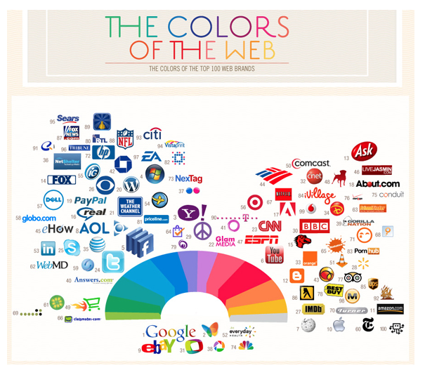
I recently read this article on the color palettes of popular logos on Social Media Today that showed many U.S. brands stick to just a few colors. You can easily see from the infographic that red and blue are the two most widely used brand colors.
Red is a warm color that conveys positive energy and strength. Blue is a cool color that is comforting and can convey trust and loyalty. It is very important to understand the psychology and emotion each color has on a person while working on the design. A brand discovery process of some sort is needed to really delve into the emotions and feelings the brand is trying to convey to its target audience. For example, if your product is organic, the color green might be a good choice to reflect the brand’s “value” to the consumer, since green represents the earth, health and nature. Here’s a great resource for the psychology of colors.
Think about your favorite brands – according to this “color branding” idea, does the brand’s color scheme match what feelings it is conveying? And if you’re developing your own, make sure to take into consideration which brand colors will be most effective for your product or company.
Are you curious if your brand’s logo portrays the best possible emotional and psychological impact on your target audience? The Lessing-Flynn team can help! Contact our art team today for a brand analysis and refresh.
Chris Hanson has been an art director at Lessing-Flynn for 14 years.
Originally published June 26, 2013
Believe it or not, in the 1980s, Apple’s biggest rival was not Microsoft or Dell or Google. It was IBM. Big Blue. The epitome of a large, progressive world-dominators. The kind of company that made you shudder if they decided to enter your industry – because they would do it in a big, big way.
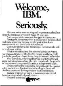 And that’s exactly what they did to Apple when they decided to enter the personal computer market. What did Apple do? Well, obviously they didn’t close up shop. They dug their feet in and competed. And they did it with confidence. They actually ran an ad welcoming IBM to the market.
That’s swagger.
It’s important for your brand to portray a level of confidence – especially when you’re a startup or you’re competing against the industry giant. Your customers need to have confidence that, if they invest their money in your product or service and invest their energy into your brand, you’ll be around to perform.
So, how do you demonstrate swagger? You do things that are bold and daring. Things that a bigger rival couldn’t touch. Things like what Mini did in their rivalry with Porsche.
A few things to consider:
Swagger doesn’t have to be expensive. The Apple ad above was a black and white ad with no graphic design. The Mini challenge video could have been shot with a flip cam. It’s more about being authentic.
There’s a fine line between swagger and cockiness. People are attracted to confidence – but are turned off by overconfidence and arrogance. To stay on the right side of the line, you need a sense of humor and hint of vulnerability or a willingness to be a bit self-deprecating.
Swagger works best when you’re the underdog. People already know when you’re the top dog. If you’re Microsoft, Google or McDonald’s, swagger can easily be misinterpreted. But if you’re not the dominant brand in your industry already, it’s best to target the top brand in your category – and make the conversation all about you and them, leaving the rest of the competitors out of the conversation.