
In kindergarten, we learned our numbers, colors, shapes, and letters through visual learning. Visual learning isn’t something that is new, but it is something that is becoming popular online and in print. Why? We are inundated with content every day, we are busy, and we need a way to digest all of the data we take in. Not to mention that some industry jargon isn’t the most accessible. As marketers, we should want our work to be understood by most anyone. Enter: infographics.
An infographic is a graphic that presents complex data in a visually appealing and easily digestible manner. Typically, infographics include text, images, icons and data. And above all, they deserve a place in your company’s marketing materials. Of course, we can’t talk the talk without walking the walk. Here are five of our best reasons to include infographics along with some of our most recent creations.
5 Reasons to Include Infographics in Marketing Materials
1. Everyone is busy.
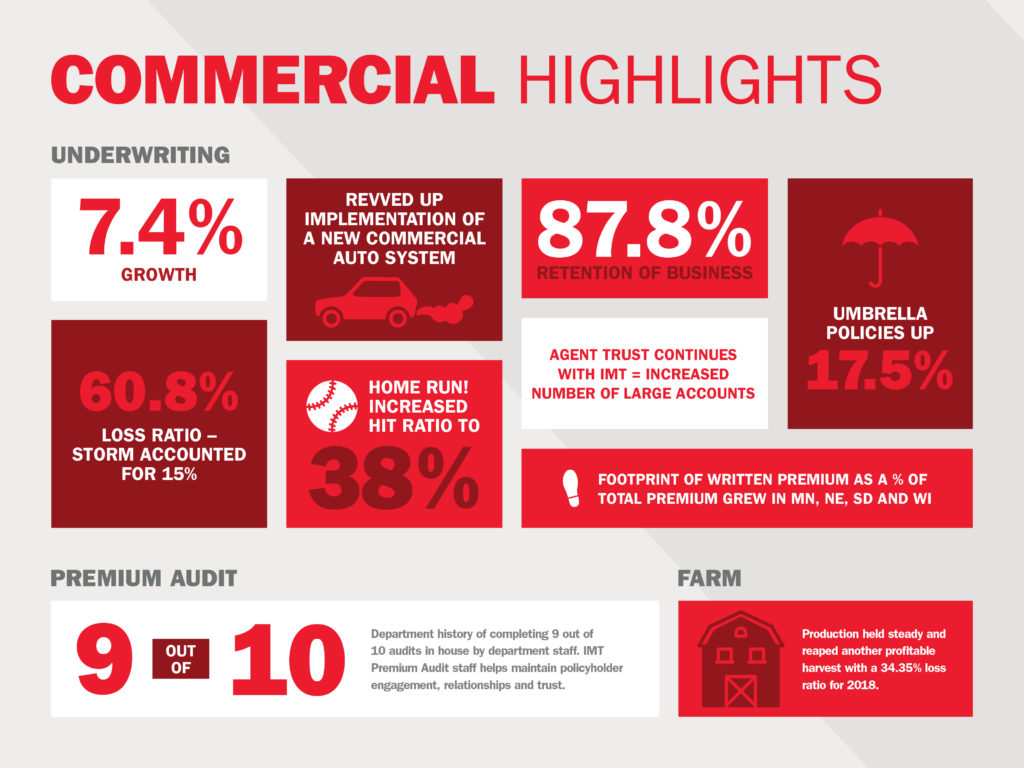
Do people have time to read your entire annual report? Probably not. Create an infographic to showcase the same information, like we did with IMT Insurance! Visuals tell the consumer what they need to know in a clean, efficient manner before sending them on their way.
2. Visual learning is key.
Seeing is believing — and let’s face it, sometimes data or processes can just be too darn complex. Infographics simplify data while still conveying what’s important and engage visual learners.
3. Infographics can be displayed in various ways.
Infographics can be elevated in many ways — as in-article graphics on your blog or even as an animated video on a landing page or on owned social channels. The opportunity to bring inforgraphics to life is limitless and creativity is encouraged!
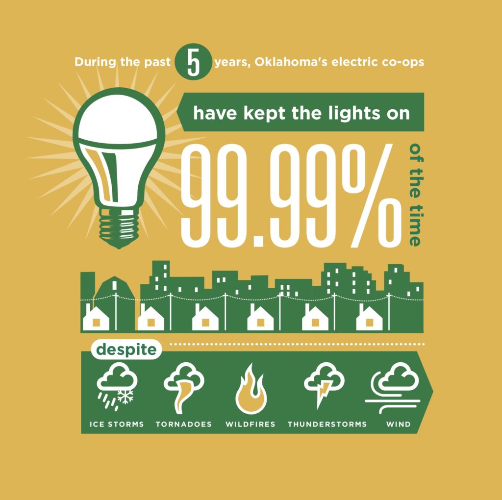
To showcase their Commitment to Safety, Okahoma’s Electric Cooperatives used existing infographics and repurposed into video content.
4. You can position yourself as an expert.
Infographics are a brand’s best friend when it comes to self-promotion. Once you slap your logo on that sucker and share it on social media, then voila! People will attribute their newfound knowledge to your brand and tell their friends how smart you are. Can’t beat word-of-mouth.
LF has used infographics to share the importance of SEO through video.
5. Hello, ROI! Track your data.
Once you’ve created your infographic, share a snippet of the data and link back to the original infographic on your website or blog. Use Google Analytics to track the traffic flow on these pages. Now look what you’ve done….you’ve driven traffic to your website!
6. Creatives are crazy talented.
Where would any of us be without our graphic designers? They have the ability to enhance any blog post, brochure, etc. with just a couple of infographics. We know our own creatives are something special and bring data to life like they were born to do, dang it.
Reach out and see how LF can bring your infographics to life for your brand.
This was originally written August 7, 2013, but updated for 2020 because not only are infographics still relevant — they’re also so much fun!
LF Newsletter Alert
Want Lessing-Flynn to rock the socks off your inbox with insights and more?