The greatest failure in marketing is being ignored. Look at the marketing campaigns in any industry and you’ll find a lot of safe strategies, familiar colors and expected “differentiators.” Sure, they tick all the boxes and get the green light from multiple layers of decision-makers. But what’s the result? Advertising that just blends in with competitors’ efforts. We call that “marketing camouflage.”
How safe choices lead to camouflage
The approval process is one of the biggest barriers to creating memorable marketing. You start with a great idea but then run the gauntlet: multiple layers of review, input from stakeholders and legal and safety departments, copyright reviews and the need for broad consensus. Each layer requires changes — soften this, remove that, play it safer here. In the end, you finish with something everyone is comfortable with.
The problem? Comfort rarely inspires or stands out (unless you’re selling mattresses!).
It’s like asking a group to choose a pizza for dinner. At first, people throw out bold ideas: “Buffalo chicken!” “Canadian bacon and pineapple!” “The works!” But as more opinions are weighed and compromises are made, the group inevitably lands on something safe and universal: like plain cheese.
But plain cheese doesn’t excite. Plain cheese doesn’t inspire. Plain cheese disappears into the background. You’ll never even remember having plain cheese pizza the next day!
Marketing = science AND art
No one plans to create uninspiring marketing. But when we let data lead creative, we run the risk of copying what’s already been done by everyone else who has access to the same data. Social media, Google and a plethora of other research tools make analytics, audience insights, and demographic data easier to access than ever. This data is important. But so is some creative thinking to ensure you’re using it in a way that will stand out to your customers.
For example: You manufacture and sell Gizmos. Your research tells you your target audience is 18-to 30-year-olds who love boats and respond to whimsical imagery. You design a campaign using a boat, playful taglines and quirky characters. The problem? Every other Gizmo company has the same data. Now the market is awash with boats and whimsical ads — and your product blends in. Camouflage.
But not if you use research as a guide and use creativity to make the journey memorable.
Standing out: Examples of bold marketing
1. Use emotion
Brundage Mountain Resort was ready to rise above their competition. Their agency could’ve taken the easy (and expected) route and created a campaign featuring a few action-packed shots of skiers flying past and some energetic music. Instead, they personified the mountain and forged an emotional connection with their audience, making the resort feel more special than any other in the area.

2. Make it memorable
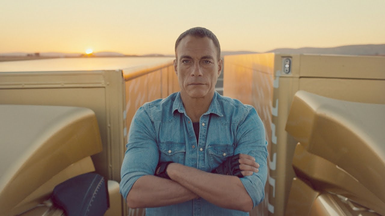
Volvo Trucks could have created a standard product demo to showcase their precision steering and smooth ride. Instead, they produced the “Epic Split” campaign, featuring Jean-Claude Van Damme performing a gravity-defying split between two moving trucks. The result? A campaign that captivated audiences far beyond their industry and stole any attention their competitors hoped to gain.
3. Challenge norms
When car company Mini wanted to improve their brand image and create more awareness in the U.S. market to stand out from other foreign competitors, they could have just created a features-driven campaign touting advantages like fuel efficiency or maneuverability. But instead, they took a tongue-in-cheek approach by challenging one of the more-respected performance automotive brands — Porsche. The Mini vs. Porsche campaign was born.

Creativity requires courage
Creativity in marketing is risky, and risk makes people uncomfortable. That’s why so many campaigns default to what feels safe. But great marketing isn’t designed to make people comfortable — it’s designed to make them feel something.
If your marketing feels too familiar, maybe it’s time to rethink your approach. More art. Less science. Be willing to take risks. Let your campaigns challenge expectations, stir emotions, tell a compelling story and stand out from the noise.
Because in today’s crowded marketing world, people are bombarded with hundreds of marketing messages every single day. Camouflage hides you from the people you want to wow.
Don’t settle for plain cheese. Be the buffalo chicken pizza that no one can ignore.
Check out how the Lessing-Flynn team spices things up and creates brand stories that stand out among the camouflage.
When I am working on a client’s brand identity, all aspects of branding and the client’s positioning are taken into consideration when determining the color palette I am going to use. I then try to focus on a few main points:
-
- Whether the company is a business-to-business or business-to-consumer company
- If the company is product driven or service driven
- Which brand colors will have an emotional and psychological impact on the client’s target audience
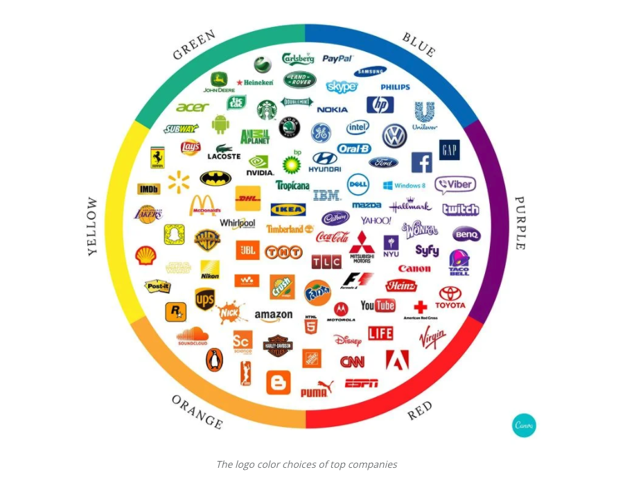
This Canva article explains how color is a powerful recall tool and how big-name brands use color. It is no wonder that a majority of financial brands choose blue as their brand color, blue is a cool color that conveys trust, loyalty and stability. It is very important to understand the psychology and emotion each color has on a person while working on the design. A brand discovery process of some sort is needed to really delve into the emotions and feelings the brand is trying to convey to its target audience. For example, if your product is organic, the color green might be a good choice to reflect the brand’s “value” to the consumer, since green represents the earth, health and nature. Check out this great resource for the psychology of colors.
Think about your favorite brands – according to this “color branding” idea, does the brand’s color scheme match what feelings it is conveying? And if you’re developing your own, make sure to take into consideration which brand colors will be most effective for your product or company.
Are you curious if your brand’s logo portrays the best possible emotional and psychological impact on your target audience? The Lessing-Flynn team can help! Contact our art team today for a brand analysis and refresh.
Chris Hanson has been an art director at Lessing-Flynn for 14 years.
Originally published June 26, 2013
Why is it important to have creative brainstorming sessions when you’re a writer or designer in a marketing agency? It’s simple: We deal in ideas. Our “product” is the creative deliverable we produce out of thin air, after a lot of research, strategy and innovative thinking. Brainstorming is vital to the process as it allows us to generate a lot of ideas in a short amount of time. It’s been the starting point for such gems as this Vermeer campaign, this Mercy College campaign and this Bank Iowa campaign. A good idea is a diamond in the rough, and a brainstorm is the carbon-rich dinosaur carcass where it all begins.
Creative brainstorming basics
There are a few rules that govern a good group brainstorming session. Follow these rules, throw out the rest, and watch your little brain-rain turn into a brain-hurricane.
1. Go for quantity over quality.
Think up as many ideas as you can. It doesn’t matter if they’re terrible; you’re just warming up! You have plenty of time to sift through and pick out the good ones later. Right now, it’s about numbers. The more ideas you have, the more fun you have, the more momentum you build, and the more options you have to choose from. No matter how silly the idea or how stupid you look, blurt it out with confidence! This will have the added benefit of encouraging your team to do the same.
2. Criticize? Nah, legitimize!
“No idea is a bad idea” is a lie. However, please resist the urge to dismiss an idea without even giving it a chance. This is especially true when you’re in a group brainstorm. Instead of halting an enthusiastic flurry of ideas with reasons why an idea won’t work, think up ways it could work. If nothing else, you’ll contribute to a good vibe, fun atmosphere, nonjudgmental comradery and spirit of trust that are essential to a productive brainstorm. As the creative brainstorming sessions unfold, the good ideas will stand out and the bad ones will naturally fall by the wayside.
3. The bigger the better.
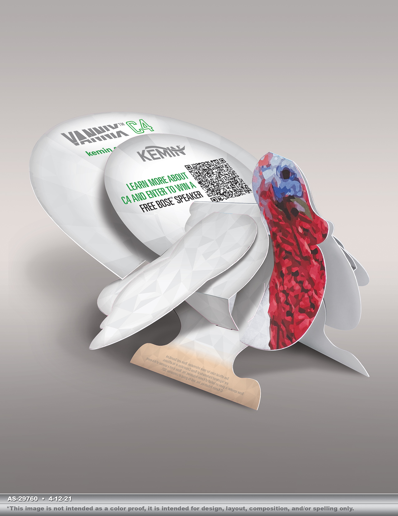
Start with big ideas, then go bigger. It’s a lot easier and more natural to tone an idea down than ramp one up. For example, “What if we deliver a turkey to every prospective customer’s office so they could see for themselves what a healthy, robust turkey should look like?!?!” was easily turned into a snazzy little 3D popup mailer for Kemin, the likes of which we’d never seen. Unique, memorable, doable. Now, if we’d started with, “What if we send customers a mailer about turkeys?” it probably would have ended up somewhere closer to this. Generic, boring, doable (though you shouldn’t do it).
4. Start riffing.
So you have lots of big ideas that haven’t been outright rejected, but they’re still terrible. No problem! These are just jumping-off points. Your bad idea may spark someone else’s creativity and inspire a good idea. Even better: Riffing on an already good idea can lead to great ideas!
Brainstorming example:
Creative 1: “How about Buck the Trend for a theme, and it’s all about how Vermeer does things their way?”
Creative 2: “I love it! And what if we got Rodeo Champ Jess Lockwood to be the spokesperson?”
Creative 3: “Now we’re getting somewhere. And for the tradeshow booth? Two words: Mechanical. Bull.”
Now is the time to leggo your ego — once your idea is out into the open and your team starts exploring its possibilities, you don’t “own” it anymore. And that’s a good thing!
Creative brainstorming techniques
After you’ve done a lot of research and have a thorough understanding of the product or service you’re marketing, it’s time to have fun! There are lots of good articles online about sophisticated brainstorming techniques that are great for certain types of projects. But if you really want to go nuts (which is what creative brainstorming sessions are all about), here are just a few of wackadoodle brainstorming techniques that have worked for me in the past:
1. Pick a word, any word
Flip open a dictionary and point to a word at random. Force yourself to create an idea using that word. It’ll get real weird real fast.
Brainstorming example: “Discombobulate. Okay…discombobulate. We tell the story of KemTRACE Chromium from the pathogens’ point of view. They’re having a great time, wreaking havoc in GI tract of a cow when BLAMMO! KemTRACE Chromium swoops in. The pathogens are confused, discombobulated, eradicated!”
2. Pick a picture, any picture
Do the same thing ^ with an image in a book or magazine.
3. Get your mind off matters and matters off your mind
Play with a fidget spinner or doodle as you think. When you stop trying so hard, ideas magically pop into your head.
Brainstorming example: “This 8 I drew kind of looks like a sideways tandem bicycle. Ha, tandem bicycle. Everybody loves a tandem bicycle. Using one in a campaign would really stand out. How can we make it happen for Bank Iowa?”
4. Crowdsource
Get lots of ideas from lots of different brains. Back in the old days, it’d be writing the question on a whiteboard and waiting a week to see who contributed what. Now with instant messenger platforms like Slack, results can take a matter of minutes.
5. Play ball
Say a word or phrase then toss a ball to the next person who has to say the first thing that comes to mind. It keeps you alert on multiple fronts and opens up your creativity.
Brainstorming example:
Creative 1: Baseball
Creative 2: Baseball diamond
Creative 3: Diamond ring
Creative 4: Ring around the rosie
Creative 5: Rosie the Riveter
Creative 6: Riveter…rivet-rivet…you know? Like a frog?
6. Take a break
There’s a reason “shower thoughts” are a thing. Go for a quick walk, read or watch something you’d normally never read or watch, play a mindless game for a few minutes…relax!
The value of creative brainstorming sessions
Understanding what goes into a brainstorming session can make you a more creative thinker and a better idea maker. At the very least, it will give you an appreciation for how one good idea is often the result of hundreds of bad ideas, hours of brain activity and several professionals stretching their imaginations. Combined with extensive knowledge of the product or service, a sound strategy and a keen eye for details, creative brainstorming sessions make a campaign electrifying!
More and more B2B brands are becoming fearless when it comes to digital ad services. Would you be shocked if I told you, two of our current ag clients have exclusively digital paid media plans?
Digital advertising, has been trending in the B2C industries for years but it’s finally starting to gain traction with B2B. Just seven years ago, LF’s client media plans had 15% or less of their total budgets dedicated to digital. Now we typically recommend a 60/40 or 50/50 split between traditional (e.g., print, radio, etc.) and digital placements.
This is the second year in a row that the Content Marketing Institute and MarketingProfs study found B2B brands shifting more of their total spend in the direction of digital marketing tactics.
Digging into digital
Some of the biggest confusion is what is considered digital paid media. The days of relying on website display banners is long behind us. While those are still valuable placements and tactics — new digital ad services have emerged. Some examples include email blasts, text blasts, video, native (check out my Native Advertising vs. Content Marketing Mythbusters) and the list goes on. We define these as publisher direct placements — meaning we partner with publishers who have first party data or develop relevant content on their website to our targeted industry. Additional examples that we define as digital non-direct (not directly purchased through publishers) include SEM, YouTube, remarketing, display campaigns, social and programmatic ad buying — many of these are purchased through the specific channel where they run (think Google, Bing, Facebook, etc.).
Agriculture: digital vs. print data
The 2017 Farm Journal Media Digital Audience Research study found that 85% of farmers have adopted mobile technology, 73% use websites to learn more information and 57% read e-newsletters. While these numbers are not staggering — the growth from five years ago is. The 2013 Farm Journal Media Digital Audience Research study also found that an average of 28% of respondents utilized the internet weekly for ag-specific information. Successful Farming’s 2017 Farmer’s Use of Media Study also found that 99% of farmers use agricultural magazines, while 71% utilize websites via their desktop or mobile device. When looking at all these stats — you might be wondering, how digital is trending when studies show that print is still the primary medium for the ag industry and others? Why should we invest more dollars in a channel that is not reaching the entire audience?
So glad you asked.
Why make the switch to digital ad services?
They are trackable – all of it is. Whether you are measuring overall campaign reach, engagement or generating hard sales leads. Because of this, there are even more benefits. You can test which messages, campaigns, offers and placements to see what drives the action you are measuring success with, using your key performance indicator (KPI). Digital advertising also allows you to target your exact audience by location, crop size, crop type and number of livestock head just to name a few examples. That means, you are investing only in an audience who will be interested in your message, product or service.
Are you ready?
When should you make digital ad services more of a priority? While this is a large question that should really warrant a separate blog post — the below are some good rules of thumb.
1. Does your website look, feel and move visitors down the conversion funnel the way you want? There is no sense in driving traffic to a website that’s not performing.
2. Do you have the ability to generate forms via your website or develop a landing/squeeze page? Certain campaigns and ad placements are designed for lead generation or to elicit some specific action.
3. Are you developing strong thought leadership content via a blog or other means? Native advertising is trending and for good reason, it works! The best native campaigns help solve industry problems or answer questions instead of advertising their product. This builds a relationship with your customers through thought leadership.
4. Have you been slowly migrating toward digital? We do not recommend turning off traditional forms of media, rather making the transition over a few years. This allows you to understand what works and your customers to get used to seeing and learning about your brand digitally.
5. Do your ad campaigns have a strong call-to-action? It’s important to have a desired action to drive and measure success.
6. Do you have a dealer co-op program that supports traditional media expenses on a local level? Investing in local and trusted print publications and radio provide a great supplemental and trusted consumption of advertiser’s message. This type of ad placement and messaging allows for different calls to action than a national media plan can – examples include speaking about available inventory, where someone can buy, local case studies, etc.
Mini case study
In 2017, we ran two campaigns for a single client using publisher targeted custom e-blasts, t-blasts, e-newsletters and ROS (run-of-site) display banners. One campaign offered a finance incentive and the other offered a branded Yeti® if the customer completed our desired action (pro tip: using a nice incentive is important to get the customer to follow through). Each campaign ran for one month to six weeks. Both campaigns combined, generated over 275,000 impressions, 2,200 clicks, more than 100 leads on landing pages and resulted in over $1 million in sales. This is a perfect example to show that digital ad services will pay dividends, if planned and purchased in a strategic and thoughtful manner.
Learn more
Our team is ready and willing to answer your digital media questions! Let us help you find the right balance of print and digital paid media for your brand — contact us today.
Originally published March 26, 2020.
Digital design and developing advertising for the digital world is just as much a science as it is an art. If you’re not accounting for both, you’re probably not maximizing your investment. I spent time visiting with a team of resident LF experts to provide insights on how to effectively design for digital advertising. Here’s what Digital Marketing Specialist Laura Plumb (LP), Graphic Designer Tiffany Rasmussen (TR) and Creative Director Chris Hanson (CH) had to say.
How do you approach designing digital ads?
TR: “To start, you have to put yourself in the viewer’s shoes. Your message has to be clear, consistent with the brand and have a strong call-to-action. One trick I’ve learned in digital design is that it’s important to review the ad as it will be displayed — not blown up on a big screen. This gives you a more real sense of how the viewer will see it.”
LP: “So much of digital advertising is mobile today that it’s important to approach it with a mobile-first mentality. That means button sizes need to be big enough, usually at least 48 x 48 pixels. File sizes need to be kept low — under 40 kb if possible. And you need to design to fit within a “grid format” so websites that are responsive are able to display your ads correctly.”
CH: “There are simple things to consider as well. The text should be in web fonts so they display correctly. Often people have their browsers set to turn images off. If you build an ad that is graphics only, they will not see the message. If you don’t maintain a level of consistency in fonts, colors, and imagery, you can lose brand consistency.”
Explain the biggest difference between digital design and design for traditional print advertising.
LP: “There are a lot of things to consider with digital ads. The biggest is that it can be displayed on any number of devices. If you’re designing for a magazine, you know your ad will be printed on paper in a specific size. But when it’s digital, your ad will display a number of different sizes on various mobile phones, tablets, or computer screens. Your ad is going to appear different on each one.”
TR: “From a design standpoint, readability is key. The space is small. You can’t have a lot of text. You almost have to think of it as a billboard. Seven words and a strong call-to-action. If you try to do too much, people will just ignore your ad.”
CH: “One thing is that frequency of the ad is much higher. Someone might see a print ad in a magazine once, but they not see it again for a month (or again for that matter). But with digital, you might see the same ad 20 times in a week. So there’s a balance between what we call ad fatigue and also making sure you’re being consistent with the brand.”
What other trends are you seeing in digital design?
TR: “I don’t know if I’d call it a trend, but designing with high contrast in colors is important – especially for those with impaired vision. It’s just smart design and it shows that your brand is aware which puts it in a positive light in the eyes of viewers.”
LP: “We also see things like Apple’s switch to allow people to use “dark mode“. This means that the look of an email, for example, can be completely different. You need to design things with that in consideration. Using a smaller color palette is smart. When designing video ads, using text or subtitles is smart, as a majority of video ads are played without sound.
CH: “There are a lot of new ways to expand or extend your digital ads. Video and gifs bring motion to ads. Carousel ads, for example, allow the viewer to interact with your ad. There are new formats being launched all the time. The one thing you need to be careful of is that search engines like Google give sites a lower rank for using ad formats that some would consider large and intrusive. That means you risk potentially less traffic.”
Any final takeaways?
CH: “The last thing I would say is that it’s important to think through the entire experience. Does your ad stand out on the site? Is it easy to read and understand? Does it have a strong call to action? When you click, does the experience continue with a landing page that makes sense, or are you dumping them on a home page, expecting them to figure out what to do next? Are your retargeting ads complementary to your brand and the experience they have already had? Brand experience plays such an important role in credibility. If your brand is choppy from the viewer’s perspective, they may be less inclined to take the next step.”
It is clear that design for digital isn’t as simple as print ads were back in the day. That’s why we’re here to help. Ready to chat? Give us a ring and let’s drum up something great.
At Lessing-Flynn, we consider ourselves to be the stewards of brand storytelling. Sure, other labels apply: account managers, copywriters, art directors, PR specialists, web designers, social media maestros, voracious consumers of sandwiches, etc. But first and foremost, we focus on brand storytelling.
We serve businesses from a bevy of industries and partner with organizations advocating exceptional causes. No two brands provide the same products and services or champion identical issues. Similarly, the opportunities and resources available to our clients differ greatly.
There is, however, one commonality among all of our brands: They all have interesting stories to tell. And it’s our job to tell these tales in a way that resonates with customers and stakeholders alike.
What’s the secret to good brand storytelling? You’ll soon find out.
The Six Cs of Brand Storytelling
Captains
Having a powerful central figure gives your story a protagonist. Someone to root for. These are the entrepreneurs, the visionaries and the innovators. The story of Apple will be forever linked to Steve Jobs. So, too, is the story of Walt Disney Studios permanently tied to Walt Disney. Facebook and Mark Zuckerberg. Microsoft and Bill Gates. The list goes on and on.
At Lessing-Flynn, we channel the energy of our namesakes: Paul Lessing and Roy Flynn. Does your organization have a protagonist that has the power to rally clients and onlookers alike? They’re the secret to playing the long game. Not to brag, but we’ve been around since 1907.
Culture
Raise your hand if you know who Larry Page and Sergey Brin are. Not ringing a bell? Google co-founders Larry Page and Sergey Brin are great visionaries and entrepreneurs, but neither is a very compelling central figure. That’s why few people consider Page and Brin to be the essence of Google.
When your company has no face, lean on culture. By investing in state-of-the-art facilities, product development and employee happiness, Google has fostered an almost mythical culture. It’s a fun, exciting and wondrous place where extraordinary things happen. A modern-day Wonka Chocolate Factory. Obviously, no company is Google. But companies that heavily invest in upgrading facilities, developing great products and keeping employees happy typically have good cultures.
Customer Service
What company doesn’t champion its unyielding commitment, dedication and devotion, and absolute customer satisfaction?
Buzzwords, much? Indeed, that kind of corporate rubbish appears on just about every About Us page on the web. Truth be told, few brands walk the walk. Those are the companies that get talked about. Go above and beyond for your brands, and they will rush to social media in order to sing your brand name’s praises. In other words, it’s your customer base and brands who must tell the story of your great customer service for you. So give them a reason to.
Capacity
Size, scope and structure matter. Having the largest parts inventory, the most extensive dealer network, the most product specialists, the largest facilities … the biggest, dopest Chinese finger trap.
Your company invested heavily in putting the right talent, resources, infrastructure and Chinese finger traps in place. If it’s worth investing in, it’s worth talking about. Talk about what makes your company the company.
Customers
Your company can throw cash money at a celebrity spokesperson, but such endorsements are often undermined by the fact everyone knows they’ve been bought and paid for.
Consumers are smart enough to know Kylie Jenner probably doesn’t eat Burger King on a regular basis. But when Microsoft Surface Pro started using their commercials to showcase how real illustrators and artists use their product, credibility grew. Microsoft reported a 21% year-on-year rise in Surface sales last year. Few things are more powerful than the testimonials of real people. How have your products and services helped your customers and who among them are willing to tell their story?
Consume a Sandwich
After you’re done crafting the perfect story for your brand, take some time to relax, reflect and consume a sandwich. Just because Kylie Jenner doesn’t eat Whoppers and Impossible Burgers doesn’t mean you can’t.
Storytelling is a learned art, but all it takes is some practice. Think about what aspects of your brand are most factually important but also have the largest emotional appeal. Using your sharpened brand storytelling skills, go out and make people care.
This was originally written June 4, 2013, but brand storytelling is timeless! Tell it with authority this year.
In kindergarten, we learned our numbers, colors, shapes, and letters through visual learning. Visual learning isn’t something that is new, but it is something that is becoming popular online and in print. Why? We are inundated with content every day, we are busy, and we need a way to digest all of the data we take in. Not to mention that some industry jargon isn’t the most accessible. As marketers, we should want our work to be understood by most anyone. Enter: infographics.
An infographic is a graphic that presents complex data in a visually appealing and easily digestible manner. Typically, infographics include text, images, icons and data. And above all, they deserve a place in your company’s marketing materials. Of course, we can’t talk the talk without walking the walk. Here are five of our best reasons to include infographics along with some of our most recent creations.
5 Reasons to Include Infographics in Marketing Materials
1. Everyone is busy.
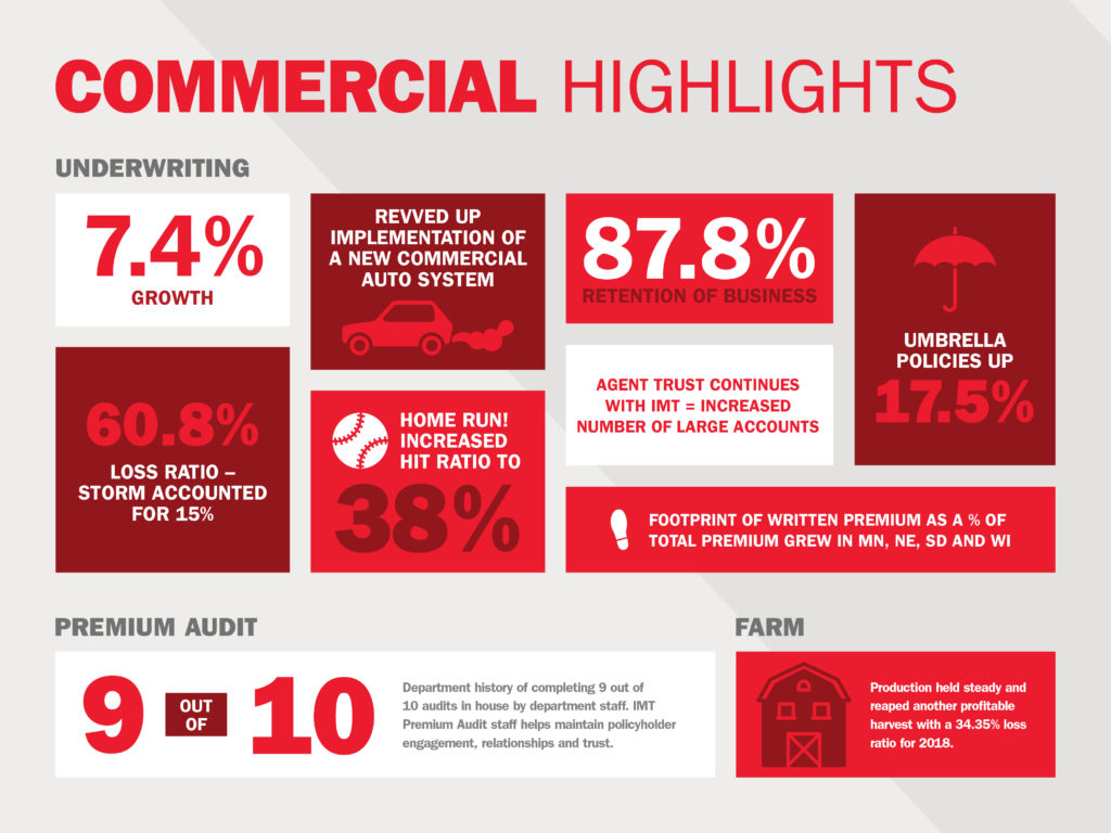
Do people have time to read your entire annual report? Probably not. Create an infographic to showcase the same information, like we did with IMT Insurance! Visuals tell the consumer what they need to know in a clean, efficient manner before sending them on their way.
2. Visual learning is key.
Seeing is believing — and let’s face it, sometimes data or processes can just be too darn complex. Infographics simplify data while still conveying what’s important and engage visual learners.
3. Infographics can be displayed in various ways.
Infographics can be elevated in many ways — as in-article graphics on your blog or even as an animated video on a landing page or on owned social channels. The opportunity to bring inforgraphics to life is limitless and creativity is encouraged!
To showcase their Commitment to Safety, Okahoma’s Electric Cooperatives used existing infographics and repurposed into video content.
4. You can position yourself as an expert.
Infographics are a brand’s best friend when it comes to self-promotion. Once you slap your logo on that sucker and share it on social media, then voila! People will attribute their newfound knowledge to your brand and tell their friends how smart you are. Can’t beat word-of-mouth.
LF has used infographics to share the importance of SEO through video.
5. Hello, ROI! Track your data.
Once you’ve created your infographic, share a snippet of the data and link back to the original infographic on your website or blog. Use Google Analytics to track the traffic flow on these pages. Now look what you’ve done….you’ve driven traffic to your website!
6. Creatives are crazy talented.
Where would any of us be without our graphic designers? They have the ability to enhance any blog post, brochure, etc. with just a couple of infographics. We know our own creatives are something special and bring data to life like they were born to do, dang it.
Reach out and see how LF can bring your infographics to life for your brand.
This was originally written August 7, 2013, but updated for 2020 because not only are infographics still relevant — they’re also so much fun!
Video Strategy
I love a good steak — thick with a good sear, a little bit of sea salt and some fresh cracked black pepper. There are few things more mouth-watering than a properly-cooked dry-aged steak. In fact I’ve yet to have a bit of beef that I’ve not enjoyed. But I’m not here to wax poetically about the flat iron or share my favorite recipes. Maybe later. Instead, I want to share how my love of beef serves as good inspiration for my second passion in life: producing great video content.
Beef isn’t cheap. Raising a steer to maturity, transporting and preparation are expensive. Only eating steaks and rib-eye would cost hundreds of dollars per pound. Luckily, we’ve found ways over the course of time to make use of nearly every part of the animal. In doing so, we’ve stretched our food supply and used our resources to the best of their abilities.
Video production can also be expensive. Between paying our highly-skilled media professionals, buying or renting precision equipment, travel expenses and most of all the time it takes to produce great content, the costs can add up quickly. Yet, in the same way that we wouldn’t raise a steer just for one steak dinner, we use all the assets of video production to create a variety of effective and interesting content pieces for our clients.
By going into the production process with this mindset, we can better plan on creating and using our content. This is important. We should be asking ourselves what other resources we could generate for our client, what other messages we could be communicating and how. This may include asking our interviewees additional questions, filming additional b-roll and in general, thinking beyond the immediate task at hand. This way of thinking builds versatile tools and assets for clients to use.
One 90-second testimonial can be recut into a 30-second or even a 15-second spot. Photos and audio sound bites can be combined with animation to create short GIFs or Animatics. Again, striving to use every part of raw content can lower the cost per individual piece but increase ROI. So while one steak may sound expensive, if we’re using the rest of the cow as efficiently as we can it will be one of many meals.
In fact we recently applied this production philosophy to a two-day shooting event held by our client Equipment Technologies. We had five team members shooting video on-site with multiple cameras.
While the primary focus was to capture longer 2- to 3-minute Apache Sprayer testimonials, our team is now able to re-cut hours of footage into an additional dozen short 15- to 30-second videos. We also took stills and quotes from our video production and created static display ads and social media graphics — all from one scheduled video shoot that needed to happen anyways. We’ll be using all of these stored assets for future content needs.
So whether it’s an excellent steak dinner (primary video production) or a set of skirt steak tacos (re-cuts), it’s all a part of our process of getting as much content for our client’s dollars as we possibly can and leave them hungry for more. Bon apetit.
Mercy College of Health Sciences prepares students for a career in the healthcare industry by providing a unique education experience — unlike anything found at larger, more traditional four-year institutions — focusing on smaller class sizes, industry-experienced faculty, flexible scheduling, the latest techniques and technologies, and affiliations with hospitals and clinics. Located in downtown Des Moines, Iowa, Mercy College has built an entire legacy around its specialized healthcare education programs.
The Situation
After Mercy College launched their rebrand in 2018 (including a new logo and a new color palette) their exterior signage was updated to showcase the modernized look, but interior updates were excluded initially. The campus has several buildings including a new Academic Center of Excellence, high-tech nursing simulation lab and scores of light-drenched hallways. However, several campus spaces, including a building that was a hotel in a past life, didn’t adequately reflect the new, lively brand. For students walking around campus between classes and prospective students touring the campus facilities, there was a huge opportunity to help them continue to bolster the brand through environmental graphics.
The Solution
Lessing-Flynn worked with Mercy College to develop new on-brand experiences throughout the campus with environmental graphics. The new graphics include refreshed classrooms, hallways and lobby spaces.
Lounges
There are a handful of small gathering spaces around campus. We emphasized the College’s core values, along with medical illustrations, as a nod to the college’s history as well as reinforcing the values that all students and faculty live and breathe. The walls feature a bold flood of the brand’s purple, which helps add a richness to the space.
Classroom
One of the larger, lecture-hall style classrooms was next on our list. There was ample opportunity to make the space more inviting for students and community members alike. Oversized medical illustrations now add visual interest to the walls, helping doorways blend into the front of the classroom. The front wall was painted a neutral color to minimize distractions and allow any projected images to appear clearly.
Hall of Excellence
One of the main hallways connecting two campus buildings featured dim lighting and an old china cabinet that displayed student and staff awards and achievements. We turned this space into a branded “Hall of Excellence” to give it purpose and better highlight the Mercy College core value of excellence. New glass cabinets, along with feature lighting, help bring the space up to date. A new set of glass displays now highlight all of the Mercy College accreditations — this hall now serves as a prime stop on prospective student campus tours.
Timeline
The wall outside the President’s office had served as a storage location for the Mercy College pull-up banner backdrop. The space is at a key connection point between buildings, so we took the opportunity to showcase the history of the organization with a new timeline installation that can easily be updated into the future by swapping out the dated stand-off placards.
Entrance
The entrance to their west campus buildings originally featured a large wooden cross which, while important to the Catholic institution, wasn’t helpful in directing visitors and students to the important locations on campus. The new design offers way finding through the directional arrows, and the new Mercy College logo greets visitors and sets the stage for the rest of the branded campus environment.
The Results
The campus spaces are transformed — see for yourself in the album below! Students, faculty and staff have all enjoyed the refreshed spaces. Although it is difficult to tie the campus graphics directly to enrollment, the team has received lots of positive feedback from prospective students who have said they find the campus welcoming.


Over 389 films share a sound design cinematic universe, from Star Wars to Toy Story to Anchorman; They all feature the “Wilhelm Scream” in one way or another. The Wilhelm Scream (You’ve heard it before, somewhere, guaranteed) was created for the 1951 western Distant Drums. The sound effect became a part of Warner Brothers sound library and eventually became an inside joke among sound designers.
The scream made its first big break when George Lucas asked Ben Burtt to sound design his upcoming film, Star Wars. The scream lived on in every Star Wars and Indiana Jones film and exploded from there, to over 389 films and countless more TV show. Today it’s remixed and re-used in so many different ways well beyond the “Alligator biting man” of the original recording.
THE ARGUMENT FOR BRANDED AUDIO
While the Wilhelm scream is a fun inside joke, there’s something to be said for unique audio identity. The proliferation of affordable and high-quality stock music had led to a lot of brands unknowingly sharing the same music. I’ve worked with audio tracks weeks on end during the editing process, so they’re often burned into my brain. They’re inescapable in today’s media, I’ll hear stock music walking into Costco, in TV ads and at trade shows. I’ve heard one stock song over 20 times across multiple brands and genres.
Your audio brand is more important than ever, and music serves as a very powerful tool to quickly reinforce your brand in a sea of short attention spans and shorter run-times. Music works to set the tone for a spot and can be a short-hand to convey tone and location that’s not easy to do in a visual medium. Check out this video with the same footage and four distinct pieces of stock music. Everything else is constant but the emotion of each track is so varied.
CUSTOM VS. STOCK SOUNDS
The right stock music sets up the tone and emotional context in the right way. These emotional cues are extremely effective and can set a scene faster and more efficiently than visuals alone. Putting the audience in the right context is incredibly important for conveying the message of the spot in a limited time and with impact.
So high quality stock music is both incredibly important, yet many brands unknowingly share the same audio assets, lessening your brand’s unique identity. There are two different approached to this problem. First video content creators need to be mindful of finding new interesting music that’s not overplayed and overused. I maintain a list of ten stock music sites that offer deeper cuts that’s less well known and over-used. By being diligent in the production process we can ensure that each brand gets the song that fits them best without going to the “greatest hits” bin of stock music.
Custom music is a definite solution but can be pricey. But along with it comes incredibly control over the product, allowing content creators to create the exact sound they’re looking for to tell the story. While bespoke music isn’t cheap it’s become more affordable thanks to developments in the gig economy. New sites like MusikPitch allow you to describe your project, needs, budget and timeline and allow various creators to respond and bid for the work. This lowers the cost of custom music and allows content creators to work directly with composers and musicians. Moreover these artists aren’t limited regionally or nationally but often times are located all over the world, bringing in fresh sound and perspectives.
But custom music does have downsides; chiefly among them is time. Custom music isn’t fast — from finding, selecting and sharing the vision with musicians, their time to compose, revise and deliver can take several weeks, whereas stock or licensed music is just a click and credit card away. There’s no right or wrong approach, just whatever fits the vision, budget and timeline of the project.
DEFINE YOUR VOICE
Defining the voice of a brand using stock music is equally important; vastly different tracks from one spot to the next lowers the cohesion of the brand and created a scattered feeling. The voice of the brand must be considered during the post production process and must be something the creative team agrees on.
Affordable stock and custom music is more available than ever. But video creators must be conscientious to find the music that best fits the brand in both the right voice and uniqueness — avoiding the most popular bin is a must at all costs. It requires spending more time and playing with the right sound mix but the end product is much higher quality, it’s worth the effort.
Mercy College of Health Sciences prepares students for a career in the healthcare industry by providing a unique education experience — unlike anything found at larger, more traditional four-year institutions — focusing on smaller class sizes, industry-experienced faculty, flexible scheduling, the latest techniques and technologies, and affiliations with hospitals and clinics. Located in downtown Des Moines, Iowa, Mercy College has built an entire legacy around its specialized healthcare education programs.
THE SITUATION
The Mercy College team came to Lessing-Flynn (LF) ready to make a big impact with their marketing efforts. While their experienced faculty work tirelessly to provide the latest in healthcare curriculum — Mercy College felt their previous viewbooks were not communicating the right message or resonating with prospective students.
If you’re not familiar with college viewbooks, think of it as brochure that lays out all the reasons why someone should attend. It’s considered part of the gold-standard in college marketing — it’s used for various recruitment efforts like college fairs, high school visits, direct mail and more. So, because a college viewbook is such big piece used within the prospective student’s search process, it was important to ensure the 2018-2019 piece made the right statement.
THE SOLUTION
The traditional viewbook — you know the old 30+ page book including anything and everything about a college — well, it’s gone. That’s right, it’s completely dead. Prospective students used to get copious amounts of these hefty (and costly) print pieces, but since the dawn of the internet the needs of the prospective student audience have changed. Most potential students spend more time skimming and searching college websites for their questions rather than reading a lengthy glossy publication.
Today’s version of the viewbook has become a tool to grab attention, answer the quick questions and convey an attitude. It doesn’t give every single detail and historical reference, instead, it contains strong calls to action to the website where they can get all the extra details they want and begin the admissions process.
After reviewing past Mercy College viewbooks, LF decided to reduce and streamline the copy using a strategic content outline and design layout while incorporating a more relatable (and fun!) tone. Plus, with Mercy College’s recent brand update we made sure to use their new logo, designated colors, fonts and overall style. We also reduced the college’s “about” section and turned the focus to questions that a prospective student might have and addressed them right away. Questions such as: What majors and programs are offered at Mercy College? How do I get financial aid? What is the transfer process? How do I apply?…and many more!
THE RESULTS
The completed project provides a cohesive and concise literature piece using the updated Mercy College brand style. Both teams were able to work together to communicate the college’s story and values to any prospective student.
Recently, Mercy College of Health Sciences celebrated a record number of students who applied for admittance for the fall 2018 semester. Applications totaled 1,054 — an 8.5 percent increase over 2017. Of those applicants, 252 enrolled at Mercy College resulting in the second largest new student enrollment for any term in the college’s history.
“Gearing up for a trade show is like putting together a giant jigsaw puzzle. Pieces can come up missing, but companies should do their best in advance to make sure it all fits together to their advantage.” – Susan Friedmann, “The Tradeshow Coach”
Most companies spend the bulk of their budget on travel expenses and purchasing the display items needed for the physical experience. However, there are so many cost-efficient tactics that can be employed to optimize your brand’s presence. It’s time to think bigger than TV screen presentations and free t-shirt giveaways — and it’s time to get qualified sales leads to use after the show.
Think about your overall strategy. When your company starts planning for upcoming trade shows, it can be easy to focus on checking off your to-do list instead of the overall strategy of what you want to accomplish at each event. Redirect your planning purpose by asking yourself questions like:
- How will we generate leads?
- What will the booth experience be like?
- What action do we want people to take when they visit our booth?
Focus on cultivating leads and following up later. Speaking of leads, trade shows are a great place to connect and bring qualified leads to your sales team. Consider doing more than just scanning a badge. Consider a giveaway in the booth where attendees need to provide their information to enter. After the trade show, follow up by sending attendees an email to download your latest white paper or follow up with information on a product demonstration.
Promote your trade show experience before the show for a two-fold strategy. By sending a pre-show email you can benefit by 1) opening the door for remarketing tactics to take advantage of their interest during and after the show and 2) boosting foot traffic during the event. For example: Send out an email with a form — let’s say it’s for a trade show raffle prize. Then send a confirmation email stating that bringing their ticket number to the booth will earn them three more tickets for the raffle prize.
Even if they don’t fill out the form, if they click with the email on other promotions, you can retarget them later using Google or Facebook remarketing (you know, the ads that follow you around after you’ve visited a site). You might not love these ad tactics personally, but the data shows they can be super drivers of conversions, especially with an offer attached.
Keep your audience engaged on and off-site. An integrated approach can reach and engage your audience before, during and after the show. Set your trade show strategy apart by engaging your offsite audience and making them feel like they were at the show, too. Think about options like Facebook and Instagram Live.
Find ways to integrate technology within your booth. As technology continues to evolve, there is a great opportunity to create an experience in your booth using things like augmented reality (AR) and touch screens. For example, some LF clients have brought their products to life at trade shows by using AR that demonstrates how their equipment or product works. We’ve also seen clients showcase videos in their booth with touch screens to create an interactive experience. It makes a big difference when someone has an experience in your booth that drives them to want to learn more. Make sure your booth is staffed with appropriate sales and product team members to have the right discussion with potential customers. If they are a qualified lead, consider offering additional incentives if they share their information or sign up for additional experiences.
Do you like some of these ideas? Well this is just the tip of the iceberg! Connect with our team at LF for help with a strategic plan for an upcoming trade show or other creative ideas. We’re always ready and willing to help!